|
|
|
Some settings you should probably change to these [updated for 3.0]: • General - might be useful to raise the undo levels, especially for typesetting • Audio settings should look something like this: 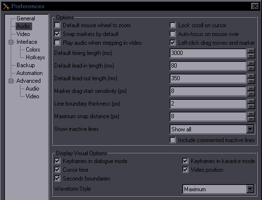 Make sure to enable "Snap markers" "Show all" inactive lines is useful especially for timing. • Video - set default width/height to 1280/720 as that's what we use 99% of the time. 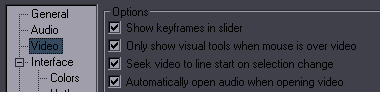 The 2nd checkbox is useful for typesetting because sometimes the tools get in the way. • Hotkeys: change the ones you need so that you can use them more easily You can also change colors for the subtitle grid and audio display. I find it especially useful for the subtitle grid, as the defaults can be hard to tell apart. If you're like me, you're gonna reverse the whole thing:  [Sometimes I get asked how I changed the main BG color [darkish grey on picture below] - that's windows settings] Script Resolution [This is important] 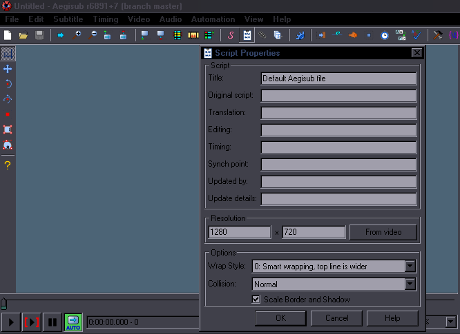 When you click that white paper icon up there, you'll see this Script Properties dialogue, where, among a lot of irrelevant things, you have Resolution. This is something you always have to check and always set correctly. TL;DR - 99% of the time we use 1280x720 so set it to that. Make sure you don't keep 848x480 when using HS scripts. Setting script resolution goes along with importing styles so get used to doing both together. How it works, long explanation: This sets the resolution of the workspace for the subs. Whatever values you use will be 'stretched' to the whole video by the subtitle renderer, and all positioning etc. is calculated from that. If you set 100x100 and put it on a 1280x720 video, letters will be widened and huge, and \pos(50,50) will appear at (640,360) of the video. Or another example, if you set it to 128x72, then every pixel of your script will correspond to 10x10 pixels of the video. Which means you'll have shitty accuracy for positioning. [update: actually letters shouldn't get stretched because only the vertical value is used for resampling but some weird stuff does happen when you change the aspect ratio...] Using a 480p script for a 720p video basically works [HS has a 480p script for all 3 videos] but you have to understand the problems that may arise from doing that. Firstly, once you set the resolution, you have to do everything in that resolution and never change it. If you change it, all sizes and positions go haywire. Which also means, secondly, that all the styles are closely tied to the resolution. Since we use the same styles [at least the Default/OP/ED] for all episodes of any given show, changing the resolution in a random episode would be a disaster. Also, as I said, with higher resolution you have more accuracy so it's dumb to use lower script resolution than the video is. You could technically use 12800x7200 for even more accuracy, and it would work, but you'd be dealing with a lot of lag. When do we not use 1280x720? Some things air in lower quality, some OVAs only stream in 480p on the web. Un-Go was encoded in 576p so we used 1024x576 for that show. However... Another [the show] was in 720p, while the OVA was in 576p. Since I was obviously gonna use the styles from the earlier episodes, I certainly didn't feel like changing all the sizes and song styling for a 576p script, so I used 720p script for the OVA, so I could keep all the styles as they were. So we really only use a different script resolution for something that's encoded in that resolution from the beginning. You'll learn the basics of timing and typesetting elsewhere, so here's just a few useful things that you might miss: 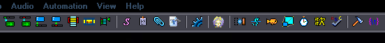 ^ The first 4 icons. First 2 are self-explanatory, second 2 for frame timing are explained in Typesetting Basics. The icon under View. Useful for shifting. Select lines you want to shift, search in video for the frame where you want the The S under Help is the Styles Manager, the next one is where you set Script Resolution [described above]. The one after the human head is for more shifting options, the clock icon opens the TPP. The one between the fish and clock is Resample Resolution... DON'T confuse it with the Script Properties and don't fucking use it! One before last is Options, the last one changes how tags are displayed in the script [try it on a typeset script]. [I suggest displaying whole tags, expecially for typesetters] 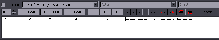 Check the Comment to make a line not show on screen. Use this if you time signs but won't be typesetting them. The typesetter can find them more easily that way and in case of some fail like "oh, did we forget to typeset this?" the unstyled signs won't show up in the release. The drop box lets you change style for the current or all selected lines. Actor field is useless. You can delete whatever's there, if it annoys you. 1 is for layers. You'll need that for typesetting, usage explained in Layers. If you're a timer only, just remember this is where it is in case you ever need it. 2, 3, 4 you normally don't need as you use either audio track or the blue icons for timing. But you can type2edit. 5,6,7 = left/right/vertical margin. Overrides default values set in Style. Lets you do it easily without adding tags. Useful for default lines when you want to avoid overlapping with other things on screen. 8 = obviously bold, italics and stuff. In case you were looking for those. 9 is where you can change the font for the current line. 10 is where you change colors for the current line. Commit doesn't exist anymore, thank god [old screenshot]. k thx bye |