|
|
Ultimately what you want to achieve is to make your typesets blend in, to make them look like they belong there. If possible, to make them look like they were there in the first place, so that when somebody watches the episode, they don't think "oh, somebody put text here to tell me what this sign means." Ideally the viewer shouldn't even notice something was added. The typeset shouldn't stand out, being the first thing you notice because it looks out of place. Making it blend in prefectly is not always possible, so sometimes you just need to make sure it doesn't look distractive/odd/ugly. The way to achieve this is by combining all the things you've learned in the previous chapters. Choose a good font, find a reasonable position for the sign, make sure to get all the colours, borders and shadows right, align it correctly, use as much blur as needed to make it look natural, etc. Sometimes there are several reasonable ways you can typeset a sign, so choosing the best one will make a difference too. [Sometimes that requires thinking outside the box a bit.] For example this one...  You could try to squeeze the typeset somewhere around the JP letters, or put it outside the box, but that would pose obvious problems. The thing you can make use of here is that the box is a regular rectangle and the background is one solid colour. Which means it will be extremely easy to just replace the sign without any interference.  I didn't even use drawing mode here, just 'opaque box' for border. 2015 Note: But that's dumb, so don't do that. It was a long time ago.  Here you need to pick the right font and match the size and thickness of the letters. [And obviously have no border/shadow.] At first glance you'll hardly notice anything was added here. Looking at it some more, I'd say it could use a little bit more blur, and a little bit of alpha or slightly darker colour.  Here the challenge is aligning and positioning. Forget trying to squeeze it next to the JP or rotate it ~90 degrees [in relation to current orientation]. Just use a place where it comfortably fits and looks like it might be the title of the paper. Align correctly in both directions and add some blur to avoid jagged outline. Also make sure you're not using pure black just 'cause your style has it. Almost nothing in anime is pure black. Match colours precisely.  Use good font, match colour, add blur. Now imagine Arial with some stupid white outline and no blur, like some derps would do.  Nothing much inventive here, just follow the basic guidelines and imitate the original sign. Use a somewhat square-ish, thick font. There are 3 lines [in script], each of them has 2 layers. Top layer has matching colour [red-ish/blue] and a shadow [no border]. Match the shadow distance. Match the transparency/colour of the shadow, not just black "cuz it was there". Bottom layer has white outline and another shadow, this one with a lot more transparency. Since the whole trick here is to really just get the basics right, make sure you notice all the borders and shadows correctly. I almost missed the second shadow here. Sometimes you'll need more than 2 layers to get it all done right.  The 4 corners... would be hard or pretty much impossible to match, since there are multiple effects, embossing, texture etc. So I decided to kind of approximate the colours and at least make it look nice. Which means mainly using a nice font. Add shadow for at least some sense of depth, and play with the shadow/border till it looks decent enough. Since you can't match this exactly, there would be plenty of variations of how you could do this. IMO you're better off using some nice script font even if it doesn't quite match, than using TimesNR which might technically be closer but would look like shit. As for the Flashback... the font is the easy part. More interesting is the shadow. And even more interesting is that the sign was moving around earthquake style, changing the direction of the shadow on every frame. So what I did was to time it frame by frame, use \xshad and \yshad on each frame to change the shadow direction, and adjust \pos for each frame to folow the shaking movement of the JP sign. Good thing was it only took 20 frames. [If you're learning, you're not required to follow the movement & shadow frenzy. Just saying it can be done and how.]  The ones on the sides obviously can't blend in perfectly. There's hardly any space for them anywhere else, so the best you can do is to match everything as closely as possible. This isn't even as close as possible, but it's good enough. The other two can be done much better. Positioning is pretty obvious, so good font, thickness of letters etc., correct colours and a bit of blur. The top one has even that background blur [you add very little border, like 0.1-0.2, a lot of blur [4-6], and adjust colour or transparency till it looks good]. The bottom one doesn't have that because I was too lazy. Negtive points for me. The ones on the sides also need more blur. 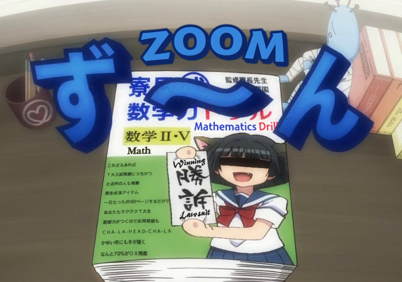 Four typesets here. The Zoom would look much better with another, top layer without border/shadow and with some blur. However the whole sign was moving and increasing in size, which means \move and \t, so adding another layer and more blur might munch on the CPU too much, so I left it like this, especially since there are 3 other signs in the picture. The 'Math' doesn't look too great, but font is ok and it doesn't stand out too much, so it's good enough. You could replace the letters on the yellow background with the 'Math,' but I don't like replacing signs if I can't replace ALL of them. Having some kanji replaced with English while there are other kanji in the picture looks lame to me [though I wouldn't say it's 'wrong']. Third one is 'Mathematics Drill.' The big blue letter covering the Drill is moving away till it's not covering the word at all. So I used \iclip to remove what was needed from the Drill, and changed the \iclip frame by frame. [Well, I was cheating, so each 2 frames.] Fourth one is the Winning Lawsuit. Didn't really give me many options as to what to do with it. 2015 Note: In retrospect, this whole sign looks pretty bad and could be much improved, and without lag as of now. As you can see, I used 4 different fonts here, trying to match the style, thickness, size etc. [as much as possible] It should be clear that all of the signs use blur. The Lawsuit could use a bit more, but then it was getting hard to read.  If you can't see the sign, it's blending in well.  I dunno, I just thought this was a cool idea... It's a typeset for the white-on-pink sign at the top. Clearly there wasn't enough space there, so...  Speaking of having some imagination... an example of how you don't always have to stick the typeset right next to the jp.  This is perfectly readable & looks good. Two layers for blur, of course, and changing colours letter by letter for the "Question."  Spikes? How? Think about it... there must be some spiky symbols you could put under the letters...  All in one line [but 2 layers for blur]. Different \frz for each letter. 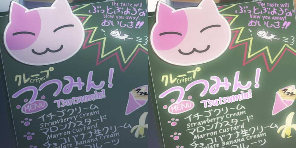 This is the kind of sign that makes most typesetters go "Oh shit [am I really gonna have to typeset this?]" But it's really not that bad [unless it appears 20 times from different angles]. This only appeared 4-5 times. The one on the right has extra layers for that glow [though less glow than the JP - \blur15 on several signs at once might not be so good]. 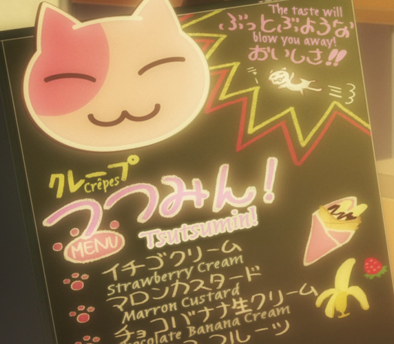 Here's one more in the evening. 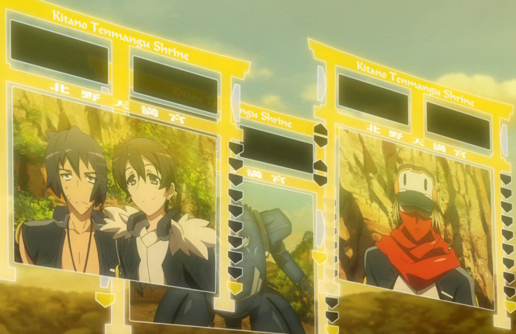 I've done so many Kitano Tenmangu Shrines that I couldn't count them. Here's 3 in one picture. Aside from aligning & blurring, the middle one has some extra features in order to blend in. I tried doing it including the semi-hidden part, and it happened to work really well. The trick is pretty much this: {\alpha&HF0&}Kitano Tenma{\alpha&H00&}ngu Shrine Btw nobody tells you it should go at the top of the shrine. You just know you're supposed to typeset the white kanji. So most people would try to put it somewhere around the kanji. Like I said, don't do that. Find a less retarded / more elegant solution.  This may look simple enough but... if you do just one layer...  ...it looks like this. See the difference? So yeah, another layer, different colour, a lot more blur. 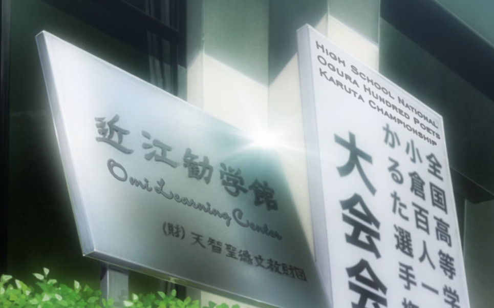 On the right... First choose a font. Then add some \fry and place \org about a mile away to get the alignment you need. [OK, maybe not that far] That may take a while to get right. Adjust font size and position till it fits. Use \fax for fine tuning. Add blur, obviously. Then the colours... The left side is brighter than the right, so I used 3 shades for each line. The whole thing looks like this: 0:02:54.02,0:02:56.07,names,Caption,0000,0000,0000,,{\an7\fs34\fax0.04\fscy110\bord0.5\blur0.8\frx6\fry18\org(839,950)\frz6.258\pos(800,-45) \alpha&H80&\c&H464036&}High Schoo{\alpha&H75&}l {\alpha&H70&}Nat{\alpha&H60&&}ional \N{\alpha&H80}Ogura Hu{\alpha&H75&}nd{\alpha&H70&}red {\alpha&H60&}Poets \N{\alpha&H80&}Karuta {\alpha&H75&}Ch{\alpha&H70&}ampion{\alpha&H60&}sh{\alpha&H55&}ip Omi Learning Center was even more interesting. Font, positioning and aligning is obvious. I don't even remember but apparently \frz\fry\fax. The background changes colour/brightness a lot from left to right. That was the biggest challenge. \alpha probably helped with a bit of that. Most of it was done by changing shades for main + outline colour for almost each letter. It also has both border and shadow. There's \yshad on top of that, which actually created a bit of an effect that I didn't even expect, where the top edge of the letters looks brighter. I'm not even sure why that happened but it was a nice bonus. Whole thing here: 0:02:54.02,0:02:56.07,Chiha-title,Caption,0000,0000,0000,,{\fs45\shad1\yshad1.5\blur1\fax1\b1\alpha&H99&\frx0\fry9\c&H928C7B&\3c&H595445& \4c&H2E2D27&\frz338.838\pos(459,408)}O{\alpha&H90&}mi {\alpha&H80&\c&H96927C&}Le{\c&H8B8E73&}ar{\c&H767A65&}ning {\c&H666851&}C{\c&H5C5B45& \3c&H4B4637&}e{\c&H515038&\3c&H423D2F&}n{\c&H48472F&\3c&H353024&}t{\c&H3E3D2B&\3c&H2C271C&}e{\c&H393826&\3c&H241F16&}r So yeah, sometimes it takes a bit longer to make it look good.  Signs like this are awesome. They're not moving, so you don't have to chase them across the screen, but you get to have fun with the details. So how do you imitate all the borders/shadows? 5 layers. Layer 5 - just the green letters without border. Increase letter spacing to avoid too much overlapping of the letters. Layer 4 - \xshad-3\yshad-3 with the light colour. Layer 3 - \shad3 with the darker green. Layer 2 - \bord3 with the same colour as Layer 5 - to fill in the corners. Layer 1 - \bord6.5 in dark grey and \shad5 in dark green. ...and of course blur on everything.  Similarly here you have a date with an outline but also a 'light reflection' on the left and at the top. Pick a simple sans serif font that will roughly match the thickness of the letters. Use layers with \xshad \yshad, or just an extra layer shifted a pixel up and left. Fairly simple.  On the other hand, you don't really have to match this sign, in my opinion. If you do something else that doesn't look out of place, it should work. If someone says you're a retard because the sign doesn't match [I've seen that happen], he's just being dumb himself. It seems unnecessary to me to "match" something that isn't actually on the screen [because you masked it].  Another fun sign [Maria Holic is full of them]. The cool thing here is that it's all done in 1 line. All you need is one \N, different \frz for each word, and move \org somewhere far. Additionally the words are moving back and forth every 2-3 frames, so I timed frame by frame and changed \pos by 1 pixel back and forth. While 1 pixel isn't much normally, the effect when you have \org somewhere far is pretty cool with all those \frzs. 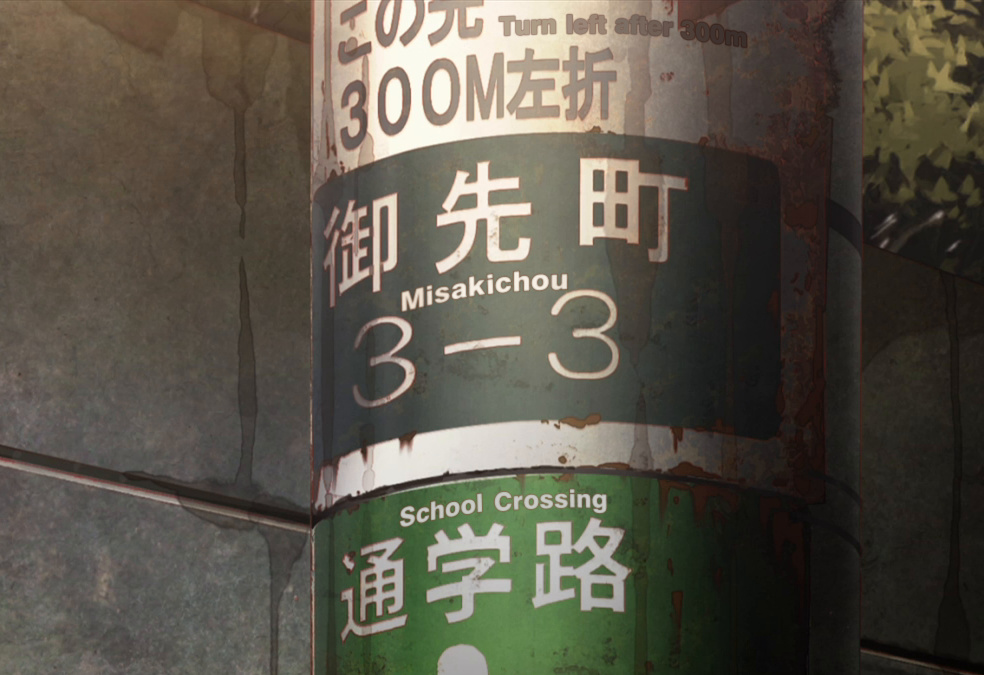 One hour of work. 39 lines. Just because I can. [Still not perfect, though.] Original line in script was "Misakichou 3-3". I decided while I'm at it, I might as well do the rest. All signs are in 2 layers, to get blur on both the outline and primary colour. Split to make a line for each ~2 letters. Positioning, rotating, \fax-ing. Takes a while to get it right [and the top one is still wrong]. For the top one I also had to change colour for each letter [and outline] because the background darkens a lot from left to right.  Nothing should stand out as obviously added.   More examples of smooth blending. Good fonts, right blur, correct colours, good positioning and alignment. Recently I had this "karaoke" sign to typeset, which seemed rather challenging. 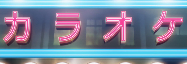 I knew I couldn't get it to be too similar, so I had to figure out something that just wouldn't stand out too much. I ended up with this: 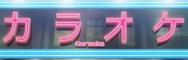 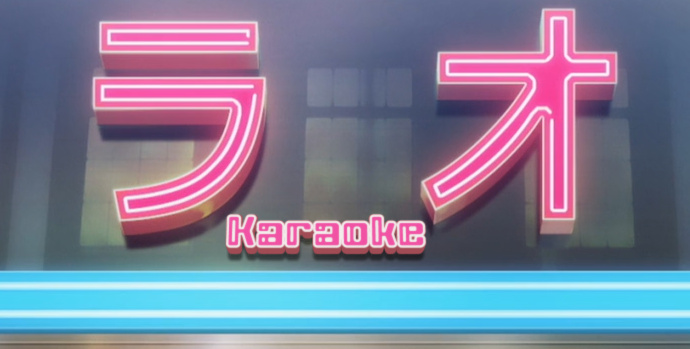 There was another one, from a different angle: 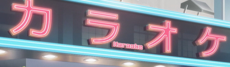 I think it looks pretty plausible, all things considered, especially given that it didn't really take that much time.  This was on the first few frames of a zoom out. What you have to do to get it like this is two things: 1. gradient the blur 2. make 2 or 3 lines with slightly different \fsp and align them on the right  Here the right font means about 70% of the success. What I often do for signs like this one is use quite a bit of \fsp. When you don't have enough space to make the English as large as the Japanese, this helps.  Only the middle part is typeset. What helps in this one is the glow. This is \blur8 and \alpha&HB0&. For comparison, here's a split image - top half without glow, bottom with glow:  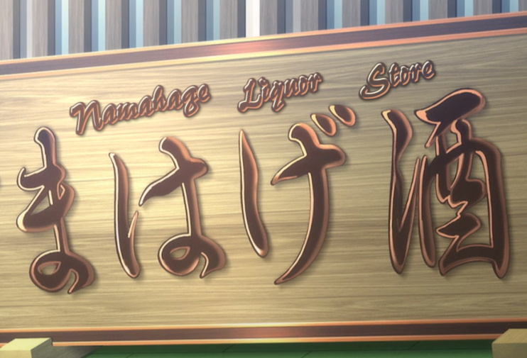 I like signs like this one, where you get to do something interesting that looks nice, without it being difficult. 4 layers: 1 (top): brown centre with that (more or less) orange shadow 2. similar but shadow is light and on the other side (top left) 3. brown border 4. (bottom): separate layer for the shadow, as it was much more blur than the border |