|
|
Here I'll be posting some examples of typesets that I've found in various releases. Some of them not too bad but could easily be better, some of them pretty bad for no good reason. I'll be updating this page as I find new interesting things.  This is dickpants typesetting 101. JP sign: large thick "serif" (not sure how to define that in kanji but should be close enough) font, no border, has shadow. "Typeset:" small thin sans serif font, no shadow, fucking black border... Question: Why? I can't believe this was actually released. No matter how little you know about typesetting, you should be albe to handle borders and shadows. Font size is pretty easy as well. Takes 1 minute to fix, out of which 40 seconds will be looking for a good font...  How hard can this be? ^ Same here...  Might be good to use a font with dots, nuke that retarded border, add a little blur...  There you go. Viewers might as well think the studio used both Japanese and english title. Even if you don't have a font with dots, it would still be common sense to at least type \bord0.  I don't even... 90 degrees rotation successful, yes, but that's about it. Well, I'll give credit for the font on the left. That works (but not like this). Other than that, it's "Herp derp. Let's put some text over here... bam! Finished." Left sign: Text is black, so keep it that way, and place it somewhere where it doesn't overlap with other things. Right sign: If you have to choose between placing the TS a bit further from the sign with smaller font, and full retard mode, please don't choose full retard mode.  This is still all very easy. Nuke (something that looks totally like) Arial, nuke border where it shouldn't be, don't use colours that aren't even on the screen, add a bit of blur. Oh and don't place typesets "over" the signs, duh. This "let's put it as close to the original sign as possible" strategy is pretty dumb.  Muru Muru tries harder and so does the typesetter. Too bad he still fails. The colours kind of match, mostly, so that's an improvement. Font is not Arial so that's another. Aside from the one in the red box though, the font still sucks. Using a very round font for squarish signs is not the brightest choice. The next obvious thing is the border. The JP signs have a very thick one, so why use thin? Probably the most awesome thing though... watch how the "Future Diary" casts a sharp bright shadow over dark things. Amazing, huh? So, dear typesetting students, if you want a shadow that isn't too dark, you don't do it by choosing grey colour. You do it by increasing transparency. (\4a&H90& or whatever value works) And use the damn \blur tag.  So, pick better fonts, fix the borders and shadows, and it looks a lot less fake. This is still far from great, but it's far better than the one above and took only a few minutes to change. The bottom sign could be much better, but since there are already 3 signs on the screen, I didn't want to add too many layers with blur, since it might lag.  Not bad, generally fits in, but...  ...font and one extra layer, and you're much closer. The middle layer has dark inner colour and thin bright border and is positioned a bit up and left. Bottom layer is just one colour and \blur5. 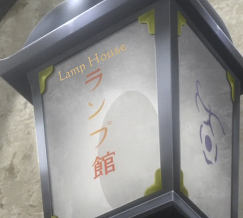 Here you obviously have a problem with alignment, and colour doesn't match.  This one's much better on both counts, but still has issues. The alignment is still a bit off, but few people would notice. Main problem is readability, because of the colour, especially for 'Lamp'. Let's explain one thing here... I'm sure the colour was matched with eyedropper, but that doesn't always work. The reason is difference in background brightness. The typeset is on darker background than most of the JP sign. The darker the background, the darker the font has to be. You can check with eyedropper that the JP signs follow that pattern. Otherwise visibility goes down when the brightness is similar for both, even if it's a different colour. 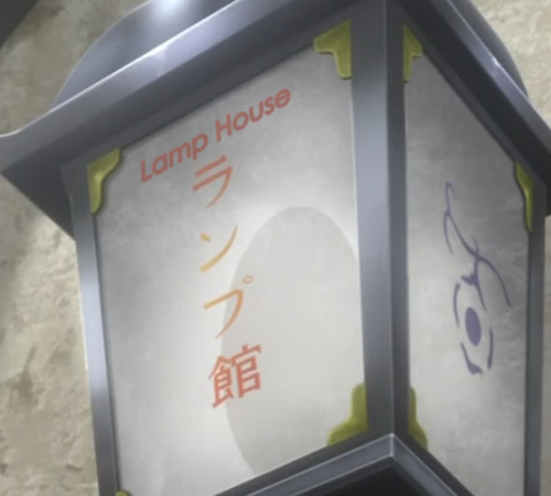 So if I fix the alignment and adjust the colours, it gets another notch better. As it often is in such cases, the colour changes a few times throughout the line, because so does the background. 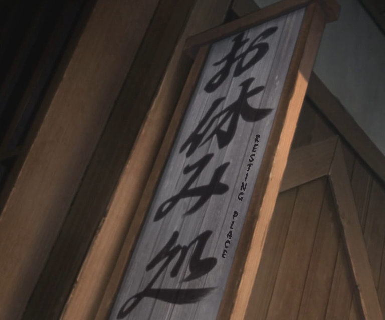 Here, have some Doki quality. Apart from the crappy translation [no, I can't read moonrunes, but I'm told by translators this is like google translate], this is typical Doki typesetting. They kinda know how to do it, but not really. They can use rotations, but do it wrong. See chapter on aligning to learn how to do it right.  Doki can always be beaten by experts from Hadena. This group is a true legend. No one else can fuck up translating, editing, timing, typesetting and encoding [let's not even mention QC here] with such magnificence. All of it apparently despite people from other groups trying to help them. So what in the bloody hell is this? - They decided to use a mask. - Failed to match the outline of the sign. - Failed to cover the bottom of the sign. - Failed to use blur on it, making it jagged as a chainsaw. - Used a bit of transparency, so that you can see the kanji underneath, for whatever unknown reason. - Used a FUCKING SHADOW on the mask! - Put text on it. - Each word going in different direction. I. Don't. Even. 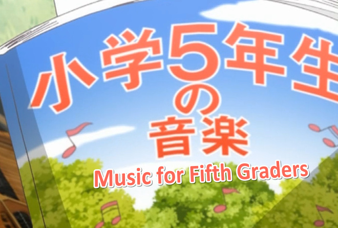 Hello. This is Hadena again. We can put text on screen, see? What? What is blur? We don't heared about this. But sharper is better quality! What, shadow? We can has no shadow? Oh. But. It look more proffessionull with shadow, no? OK, anyway... 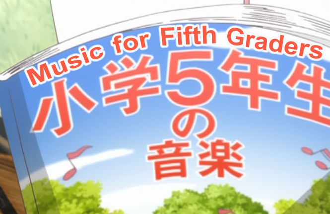 Here's some other derps. Clearly they don't have what it takes to be a legend like Hadena. So they might as well try a bit harder and produce something decent maybe. They could start by matching the colour right. I know most people wouldn't bother with 2 layers but... it looks so much better if you can blur the red as well. Oh well... 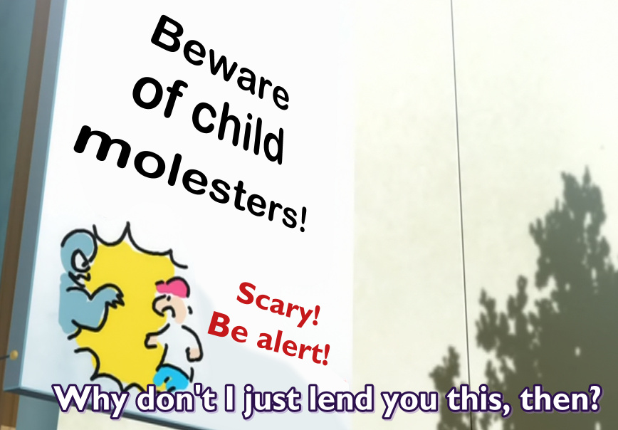 Scary indeed! Beware of brazillian typesetters! [I dunno, just guessing...] Same guys as previous sign. Maybe they should go for a legend after all. This is pretty... scary. Seeing that, somehow I'm not worried about molesters at all. There's something more sinister lurking around. Also the main font with purple shadow... 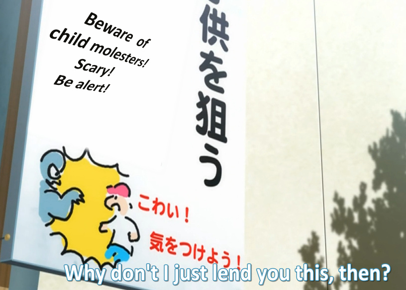 But guess what? Beware some more, because Hadena is back, motherfuckers! Typesets attacking you from unexpected angles, right about to drop a few child molesters on your head as they fly over you. 2015 Note: I have to wonder about the processes occurring in the head of the person(s) who thought that this was a good angle. Honestly, the best group for this sign was HorribleSubs with \a6. I thought the idea of fansubs was to improve the quality of crunchyroll, not make it worse. But what do I know. Here's a bunch of groups doing the same sign:  This looks ok, though the colour (and blur/glow) is a bit off.  This colour is also off, and it's missing blur on top of that.  Colour is off. I think this was herkz, who likes to laugh at others for exactly this, so feel free to laugh at him. Also it's only like 1 pixel away from the JP, which is pretty dumb, since there's plenty of space below.  Finally somebody got closer to the colour, best so far.  Here the colour is off again. I don't know what everyone's problem here is. Also seems to lack blur.  Yeah, I know what your question is. The answer is: asuka subs. What can I say?  Nope. It's true that replacing the JP seems like a good idea here since nothing's in the way. But first, this is not the kind of font you'd have on a cell phone. And more importantly, if you can't match the colour of the background, just find another job. 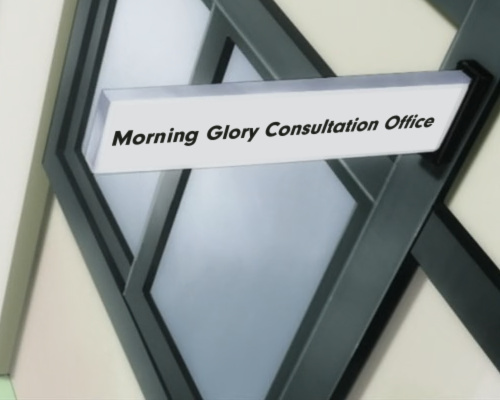 Yep. 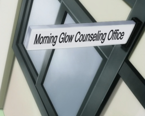 Good enough, but could be better. The end should be leaning a lot more to the right, you can clearly see the edges of the mask, etc. You know, if you just put \blur2 on the mask, it'll do the trick in many, if not most, cases. 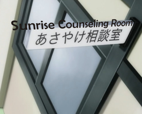 Uh-huh. Ok. You were saying you can typeset? I see. Where did you get that idea? 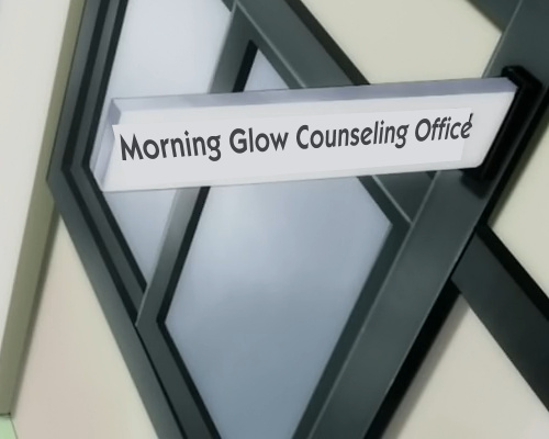 I don't even... Here's something fun I did recently: 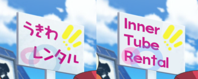 What do you need to do this? First, a fitting font. Check. Now, there's not enough space on the sign to put the English next to the jp, so... masking. Make a regular square mask, scale it to the size of the sign. Use rotation and \fax or \fay to make it fit. Use the clipping tool to cut the mask so that the yellow thing is not masked. The main problem is that you can't mask the letters without masking the circles too. You could just ignore the circles and pretend like they weren't there but... we're no amateurs here, right? So we make circles. Make letter o or O, scale it up, blur, set alpha to ~H80 [so that you can make the circles overlap], set colour. Use clip to limit the blue circle to the sign only. Now the letters... colour, blur, rotations and \fax to align the sign properly. Set the layers correctly... mask is 0, circles are 1 and 2, letters are 3. Done. 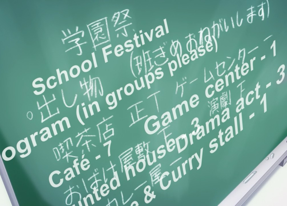 Let's take this opportunity to mention something else here. This is not really a case of bad typesetting per se. What happened here is these guys muxed in more than 36 MB of fonts. That's not only pretty retarded, but also doesn't exactly work, as you can see. It's a limit in haali splitter or something. If you go over 36 MB with attachments, it only takes whatever 36 MB it grabs first and the rest is ignored. So if you stuff your release with a few 10 MB fonts, you may end up with a bunch of fonts missing for playback and some terrible typesetting. I was using 31 fonts for Acchi Kocchi, and they were 1.3 MB all together, so I don't really get what's with this bloatcrap in many groups' releases. Also realise that somebody probably spent like half an hour typesetting this, and this is what the viewers saw in the end. While we're at this, also don't use mkvmerge over 5.1.1 [I think] because that causes some more problems with otf fonts. In fact, stick to mkvkerge 4.1.1 [or if higher, check the "disable header removal compression bla bla" option]. So that was plenty of examples of the wrong stuff. Now I should probably add some more of the good ones. I just typeset this Acchi Kocchi extra episode, so here goes... [In the light of the previous screenshot: I used 30 fonts for this episode, total size: 1.8 MB. Hell, even all the fonts I used for all the 7 Maria episodes I typeset were 3 MB in total (about 55 fonts).]   This would be the very basics: 1. appropriate font 2. correct colours 3. reasonable font size + border size 4. right amount of blur in 2 layers It shouldn't be apparent that it's not a part of the video. This is really easy, so please don't fuck up signs like these.       I would add the spikes if it wasn't moving but... it is, so meh.  Some \fsp might help a bit here.        Some clipping here. If you're gonna clip your sign, you'd better do it right, and not like some hadena or doki derps.   Shadows shouldn't be difficult either. Use \xshad & \yshad if the shadow needs a different direction. This one has only \yshad, for example.  Two borders are also easy. You just need 3 layers instead of 2.   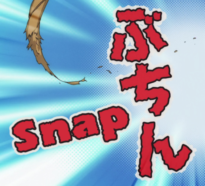 Choosing the right font can help a lot.  Using blur isn't really that difficult either. I don't know why more than half of the groups out there keep failing at this. 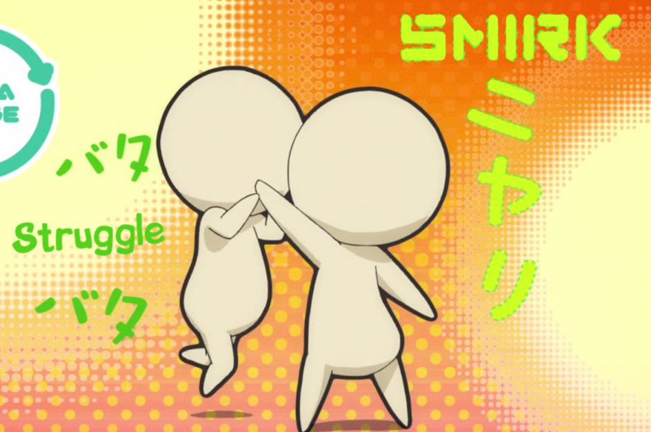 I really wanted to imitate the dotted outline here without too much effort [like ASSDrawing all of it]. So I used a font I had 2 versions of - a clean one and an eroded one [you can also see that one below]. I made the top layer with the clean one and the bottom layer with the eroded one. I didn't actually use border so i just played with the font size, scaling and spacing till it looked like this. It's not perfect, but at least it's going in the right direction. Considering that it wasn't much effort, I'd say it's decent.  This is kinda hard to reproduce because it has a lot of colours and a lot of blur and some transparency... but it didn't end up looking too bad, all things considered.  Sometimes masking is obviously the better option, because you don't wanna use \fs15 and make it look bad and unreadable at the same time. 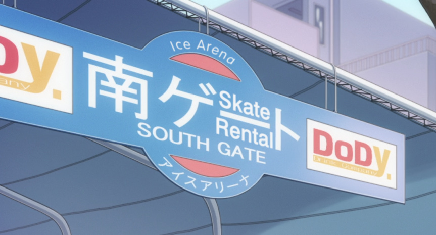 Here masking didn't work because there are like 100 shades of blue [and it moves], but the 'Skate Rental' looks pretty good like this. The 'Ice Arena' not so much, but I didn't wanna make 8 lines that are moving, so this was about the best I could do in one line. Not sure how much lag would doing each letter separately cause, but I didn't feel like trying. It would also be possible to use \org to align the letters better and mocha it but... sounds like a lot of pain, doesn't it. Besides, with the perspective here I'm not even sure what the letters should really look like [though doing each one separately would certainly improve it]. I think the main thing is to not make it stand out so that by just glancing at the picture you don't notice there's something too obviously weird.     I haven't really seen much of this outside of Acchi Kocchi, but this is the case where the sign zooms out with the first few frames zooming really quickly. Usually about 4-5 frames go from almost full screen to almost the final size, and then it goes slowly from there. Trying to mocha the first 4 frames can be near impossible and certainly frustrating, so I usually mocha from wherever it seems reasonable. After applying the mocha data I do the first 4 frames by hand - or if I feel like mocha could handle it, I track it all and fix the first few by hand. Mocha may handle the size and position fine, but at least the blur needs to be adjusted manually on the first frames. Then, after all the work you've done... nobody will notice those few frames. Welcome to the world of typesetting. Then again if they notice nothing, it's a lot better than if they notice how much you suck.  This is like 22 lines in the script [6 of them for the topmost typeset + layers for most others]. Thankfully this was at least static. But since it is static, you can play with the details without worrying about lag. It's a lot of stuff in one frame, but this is actually low-stress typesetting when you know you don't have to make everything move. You can pretty easily make this look good just with the basics - fonts, sizes, colours... some rotations and that fucking blur! Your main goal here is to make it all blend in. Like if you show it randomly to somebody who doesn't know what's going on, they shouldn't immediately go "LOL, who put these horrible captions over this?"   Layers, borders, blur, frz, fax, semitransparency on some layers... and a pretty good fade to white.  This is surprisingly easy with Clone Clip from Significance. You make one 2-pixel stripe with a clip and clone it however many times is needed to cover the height of the letters. Only 3 lines/layers are needed for this.  You won't find a font that will give you the grey/white combination like this. So I set a slightly different colour for each letter and then used a number of circle masks with different colours resized in various ways on top of the letters. |