|
|
Seeing from the results produced by typesetting apprentices, choosing fonts seems to be where they tend to fail. The main problem being that they don't really have any fonts aside from whatever is installed by default. So first you need to get at least some small collection of useful fonts. You can get those from various places. Obviously there are websites with fonts. Here are some you can try out: ufonts | fontspace | azfonts | fontsner | dafont | ffonts You can also extract fonts from decently typeset fansub releases, which is not necessarily as dumb as it sounds, since you'll easily get to a lot of fonts that are actually suitable for anime typesetting. Or you can do what I do - download large font packs from torrents, go though thousands of fonts, delete all the useless ones (yeah, about 80%) and sort the useful ones so that you know what you have and where. Obviously this takes the most time, many hours, but once you get through that, you'll have much easier time finding what you need when you're typesetting. In other words, takes time at first, but saves you time later. If you need a specific kind of font and you alreeady have 300 fonts installed that you have selected as good and suitable, it'll be easy to find one quickly. If you have to go to a website and try looking for something that would work searching by keywords, it might take long and produce poor results. 2018 Note: Seriously, sorting your fonts in folders by type makes things much easier later. Having a good font browser helps too. (Font Navigator, FontViewOK) You can certainly typeset with 20 fonts and get away with it. You will certainly get better results with 400 fonts to choose from. So it depends on what you're aiming for and how dedicated you actually are to this. Before we get to what to use, let me make a few comments on what NOT to use. • Do not use 10 MB fonts! It's stupid to increase a 200 MB mkv's size by 10 MB with just a font. Mainly for the reason that just about any 10 MB font can easily be replaced with a 100 KB one. 10 MB fonts are only justified for kanji. My general rule is to not use any fonts over 1 MB. Even fancy decorative fonts are mostly under 1 MB. Larger fonts are simply bloated with crap you don't need. Not that 2 MB would really be a problem, but just get used to checking the size to make sure you don't pick those 12 MB ones for no good reason. Which leads to another point... • Avoid system fonts, fonts starting with @, MS, Adobe etc. fonts. Not that they're all bad, but those often tend to be the large ones, and there are always plenty of similar fonts with sane filesizes. Aegisub has those @ fonts at the top of the list, so beginners will choose them 'cause they're first. Just learn to skip those every time you're choosing a font. There are no "good" ones among them anyway, trust me. They're only useful if you need kanji. Even if they happen to "fit" what you need, you can always find a similar one that isn't bloated. • Avoid notoriously known fonts like Arial, Times New Roman, ComicSans etc. If you use ComicSans, you will break rizon servers because they will get flooded with >ComicSans messages. Times New Roman might work sometimes, but it's obviously a severly overused font, and you can always find other ones of that kind. As for Arial, pretty much no Japanese sign is so ugly that you could imitate it with Arial. • Basic Serif & Sans Serif fonts... [if you don't know what that means, look it up] These are not suitable for most signs. Serif fonts may be useful for titles, as seen in the basics chapter. Basic Sans Serif fonts may be useful for cellphone/e-mail messages, or signs that clearly have no decorative elements whatsoever, like the Principal's Office sign here: 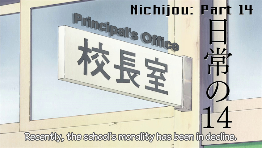 You will, however, need something thicker than Arial [even when bolded] for this, usually ones with Black or Blk in the name. For most signs you'll want to avoid these basic fonts, as it will look more like you're "putting text on screen," rather than typesetting. The typesetter's job is to make the signs look good. If we wanted to just put text on screen, we'd do it ourselves instead of hiring you. So what WILL you actually need? • Some better looking [Sans]Serif fonts That means ones that aren't as plain and ugly as Arial and TNR. • LOTS of handwriting fonts Handwriting is all over anime, so the more of these you'll have, the better. • Some brush/calligraphy fonts Kanji works great with brushes and the Japanese know it. If you want the typesets for such signs to look really good, you'll need some nice fonts of this kind. • Round/rounded fonts Some with the whole letters being round, some where just the ends are rounded. [Note: Arial Rounded MT Bold looks like shit] • Square fonts ...when they use square-ish kanji, obviously. • Chalk/pencil fonts Where would anime be without signs on school blackboards. Better have Eraser Dust and some others ready. • Fonts with eroded outline Meaning ones where the outline isn't clean but kind of jagged and stuff. • Some thick/thin/wide/narrow ones This might as well apply to each category separately. Using \fscx150 doesn't exactly produce the same results as having an actually "wide" font. Sometimes extremes are needed to either match the original or to fit the sign where you need it. • All kinds of deformed and distorted fonts Not needed most of the time, but if you want to do a really good job on a SHAFT show, it'll be useful to have all kinds of things around. Blood splatter, ripple effect, various patterns and textures, lightning and wobbly shapes. No need for beginners, but it might still be good to have a few of those around. • Cartoonish fonts These are quite common, so I'd say have as many as possible. • Decorative fonts Some script fonts and whatever fancy stuff you can find. It is kind of hard to predict what you will need, but good to have a few lying around. • Digital looking fonts, ones made out of dots, pixelated ones, typewriter fonts etc. That about covers the basics. Handwriting is a must, other than that you should have at least 2-3 of each of the other categories. I usually operate with 350-400 fonts installed, though I have at least 10000 at my disposal. [A year and a half later, 900 installed and rising.] [I think I was around 1200 before I bought new PC.] So that's what you need. Some image examples will follow below. The next step is what to use when. I'd think that would be pretty easy but... I dunno, I've seen enough fails to prove me wrong. So let's start with an example where I let some guys typeset some Nichijou and we used this Shinonome Laboratory sign to experiment with fonts. 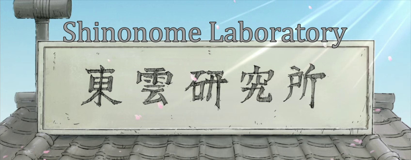 The first attempt looked like this. What should be obvious is that the JP sign looks handwritten rather than printed, the outline is kind of free rather than precise, and it has an overlay pattern. Not that you can easily imitate that pattern but it gives you an idea of the general look you should go for. Which means this attempt fails quickly. Besides the font mismatch it is poorly positioned and the colour doesn't match either. 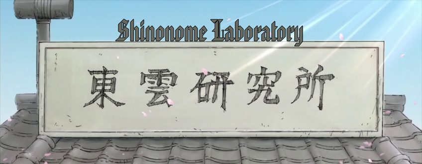 Second attempt. Improvement in colour and position, but not so much in font choice. It doesn't look like a plain typewriter font anymore, ok, but this is still too regular, mathematical, clean, and generally doesn't fit. 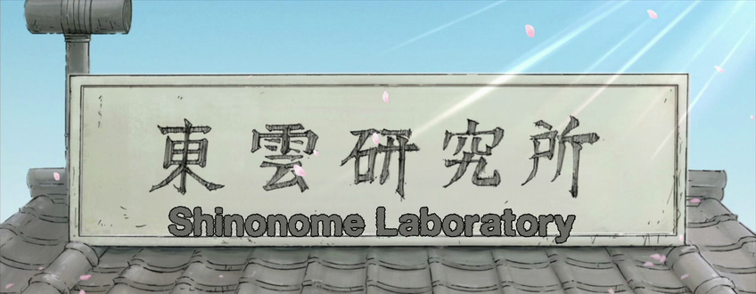 Third attempt [I think]. This has some eroded outline, so it's not as clean as the previous ones, but clearly it's almost as fat as the average American. That's bad, by the way. 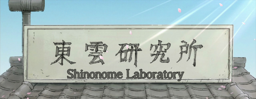 This was, I believe, the last attempt. Eroded outline, some overlay pattern, thickness matches... this passes. 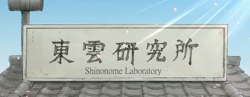 I hear this was in the actual Commie release. It... doesn't pass. Low budget typesetting edition, I guess. The next few are my examples of fonts that could be used... 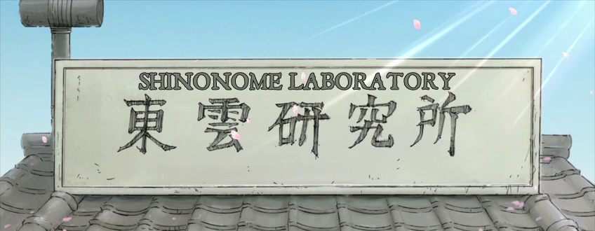 Oh yeah, I used caps because it seemed to fit better and never tried changing it for the other examples. While you will mostly get the script in capitalized lowercase, there's really no reason why you couldn't use caps for a sign like this. So, this works fine. 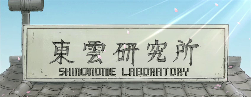 This font is squarish, but the thickness matches well enough and it's kinda irregular so... works. 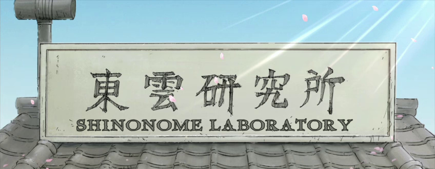 This is better. It has more space between letters which makes it look less out of place. Might actually be my favourite of these. 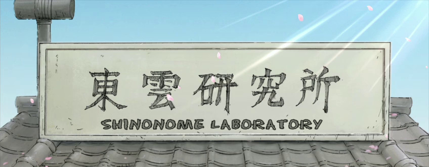 This was just a test to see how Eraser Dust would work. Nothing really great but better than those first attempts up there. Like, if your font collection is poor, this might be ok. 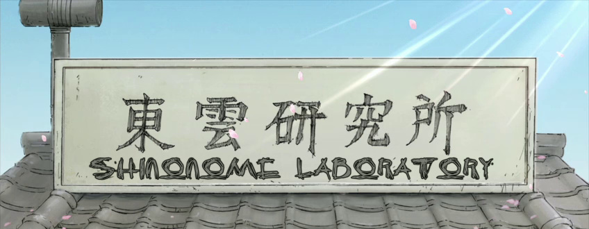 This one's pretty irregular and has lines all over the letters, but is a bit too wild. Still acceptable. In my opinion it's better to make the sign more interesting than more boring. Then again, that should have limits as well.  ...just another font that works.  This is again going a bit beyond the original, but it's much better than plain boring fonts.  This would be another of my favourites. It has pretty much all the properties of the original and isn't too crazy either. 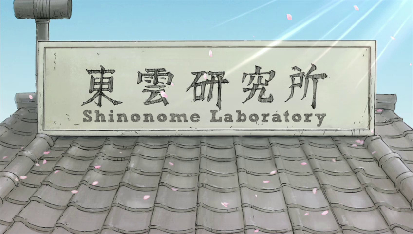 This was actually the first attempt of another guy in my "TS class", and it's fucking awesome. Very unintrusive, maybe the best of all examples. If memory serves me well, it was actually Xythar. So... I took one of the images, masked the English at the top, and tried a few fonts, so here's 2018 edition for fun: 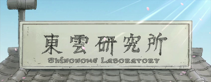         I think they somehow all look better than pretty much all the old ones... The larger your font collection is, the more you have to choose from and the higher chance of your final choice being really good. If you only have Arial, TNR, ComicSans and other basic stuff, this sign won't look too good. 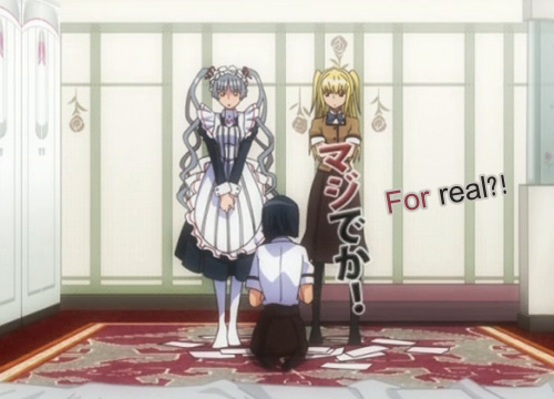 This one's from another test. It's too plain and flat.  I just changed the font and added a little bit of shadow to make it more 'plastic'. (blur fail) 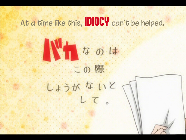 This doesn't look bad, though it lacks blur, but the red font doesn't correspond with the JP one much. [Also personally I'm a bit tired of chinacat.ttf - the other one] 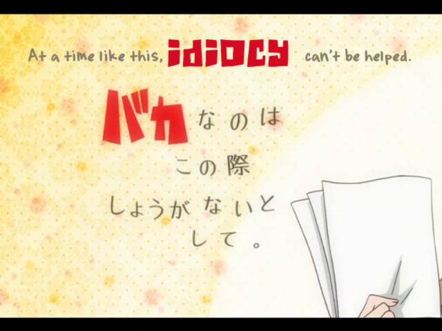 If you have enough fonts, it can make a world of difference. This red one, btw, is what I meant by 'cartoonish fonts.' Stuff like that. 2015 Note: The red colour is clearly wrong. Also, something could be done about the uneven spaces on each side of "idiocy". We've seen this next sign in the Positioning section. Here are two random examples of fonts that would work with this. 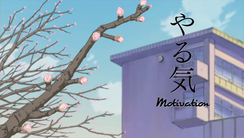 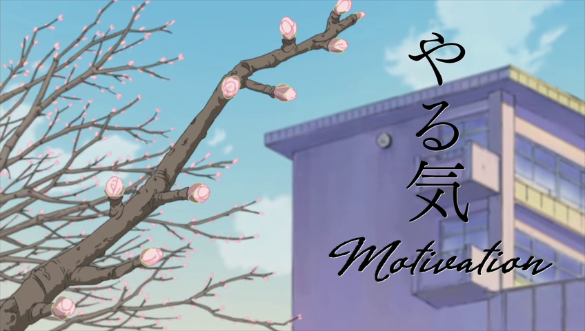 You may argue that the original sign isn't really as fancy as the typesets, and you may be right, but I'd say... I'd rather make the typeset look better than the original then make it look uglier. 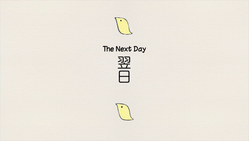 This is something you'll definitely come across. A font that looks fairly plain but is rounded at the ends. This is chinacat again, but here and here you can match the size and thickness of the letters to the original really well.  Actually no, fuck chinacat. This is how you do it. 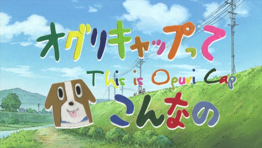 Children-style handwriting. 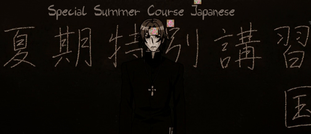 One of those chalk fonts. The pattern isn't that visible with small size, but it's good enough. 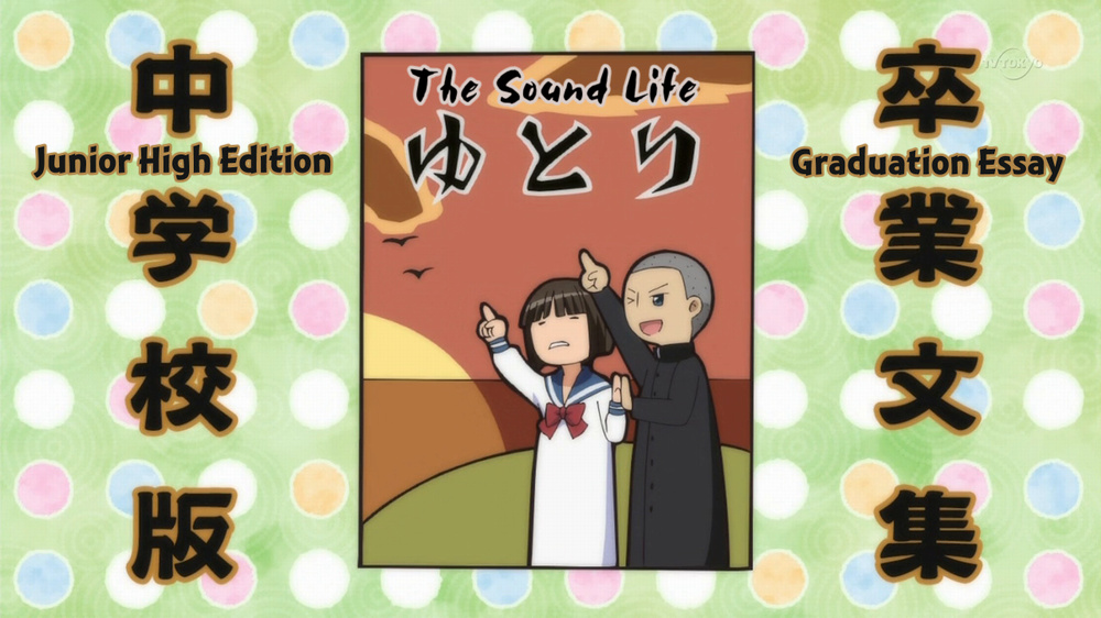 Here on the sides you have one of the not-so-plain sans serif fonts. For the middle sign, the choice of the right font is what will make it look like it belongs there. It has two layers. Both the black and white are slightly blurred to make it look natural. 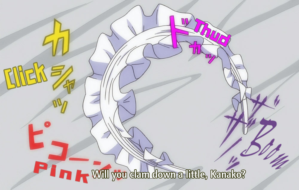 This is quite self-explanatory, so nothing to say except... I think the editor made a mistake here! 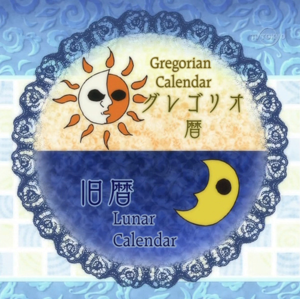 Does this work? I think it does. 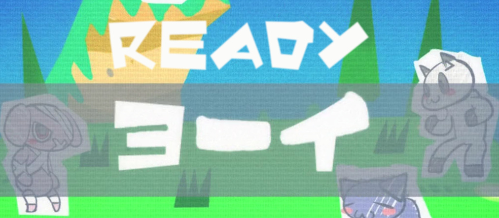 Sometimes you just find exactly the right font... Now a few things about what plain standard Japanese fonts look like, ie where you should use plain fonts too. 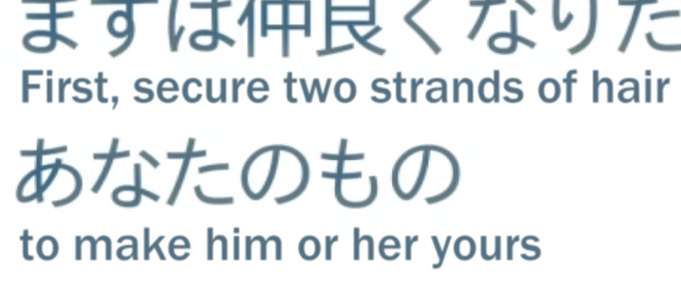 This is an ordinary sans serif font. 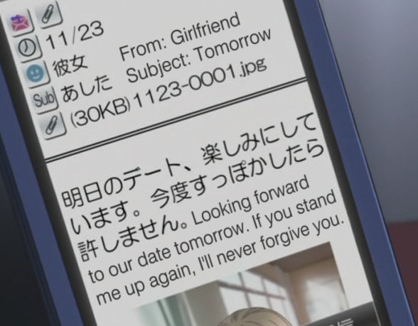 Same here. Adjust the size so that it matches the thickness, match colour, add blur, done. Well, almost, 'cause you need \frz and most likely some \fax. 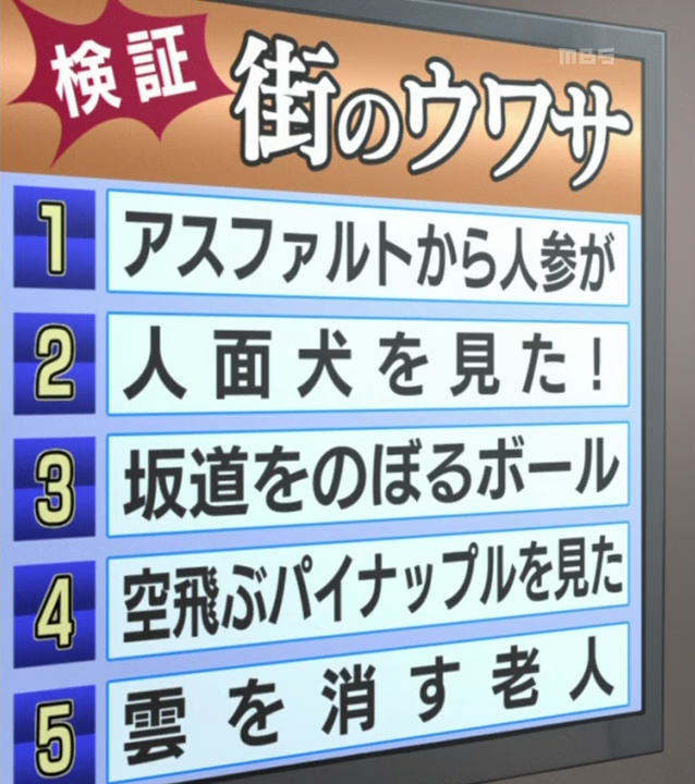 Here you have bold serif at the top right and bold sans serif below. 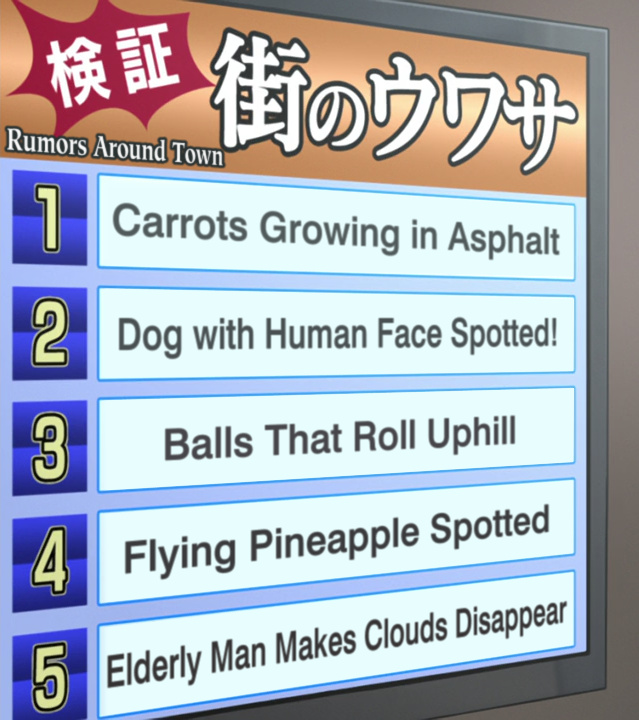 No space for the five, so you have to mask it, but you can get quite close to the original.  Simple sans serif bold/heavy/black. The border gets brighter to the right, so you can change the colour for each word. Also contains: little bit of \fry and \org, and of course blur and two layers. Uhhh... the right side should be much smaller, for the record. 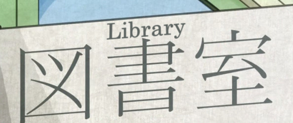 Ordinary serif font. This one's thinner than usual but since the typeset is much smaller, making it thinner wouldn't look too good here.  This is quite typical serif. 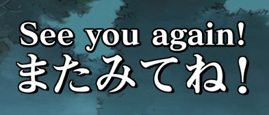 This may be a bit more rounded, but I think it's mostly because it's hiragana as opposed to kanji in the previous example. 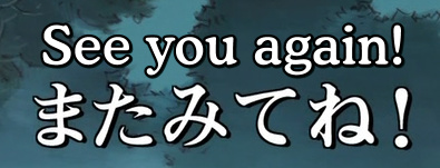 You could use somethnig more round... 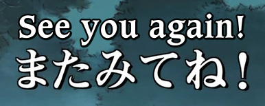 ...or something a bit more fancy. But the first one works. 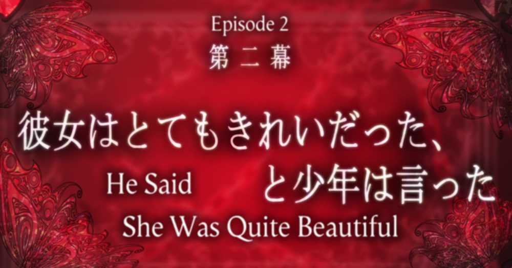 Another serif font, but this one's thinner and taller. Also play with border/blur/colour on the bottom layer until you get it right. You might wanna go for more perfection with episode titles since it's gonna be used in all episodes, so it might as well look really good. 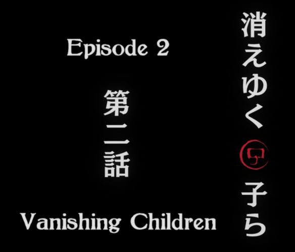 This is kind of half-serif. There are several things you should consider when picking a font for something like this. Height/width and overall thickness. This should be obvious. Then there's the ratio of horizontal vs vertical thickness. You can see the vertical lines are thicker than the horizontal ones. That is usually the case, except for simple sans serif like the "Defence Force" sign above. The ratio may differ though. On the red one just above, the difference between horizontal and vertical lines isn't big. But on the "Priestess..." higher up the horizontal lines are really thin. Here on the "Vanishing Children" there are no really thin lines. So you should try to match that. The last thing that will determine whether the font matches or not is the ends of the letters. This of course makes the serif/sans difference. The serif endings may vary a lot though. They can be sharp/pointy in various ways [Garamond, Footlight, Timpani], less so like Raleigh [Gregorian Calendar sign above] or Arno Pro, rounded [Cooper, Souvenir], short/heavy/square-ish [Acclaim, Albertus, Strayhorn, GeoSlab(numbers)] or with some decorations [Zapf Chancery]. So here for "Vanishing Children" you need serif where the endings aren't too pronounced and horizontal lines are thinner than vertical but not too thin. I think the choice here is pretty much perfect. A few typical serif examples if you have no clue what to look for: [Not Times New Roman], Garamond, Goudy Old Style, New Baskerville, Georgia, Thames, Palatino A few typical sans serif examples: [Not Arial], Franklin Gothic, Myriad Pro, Zurich, Frutiger, Liberation Sans 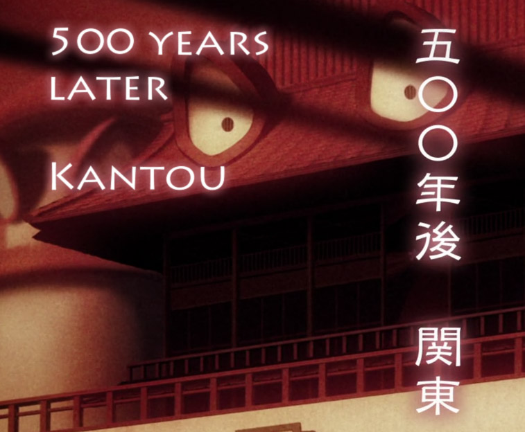 This font is very "open," with a lot of space between the lines and [almost] the same thickness of all lines. A characteristic feature here is that the zero has the same width as height. 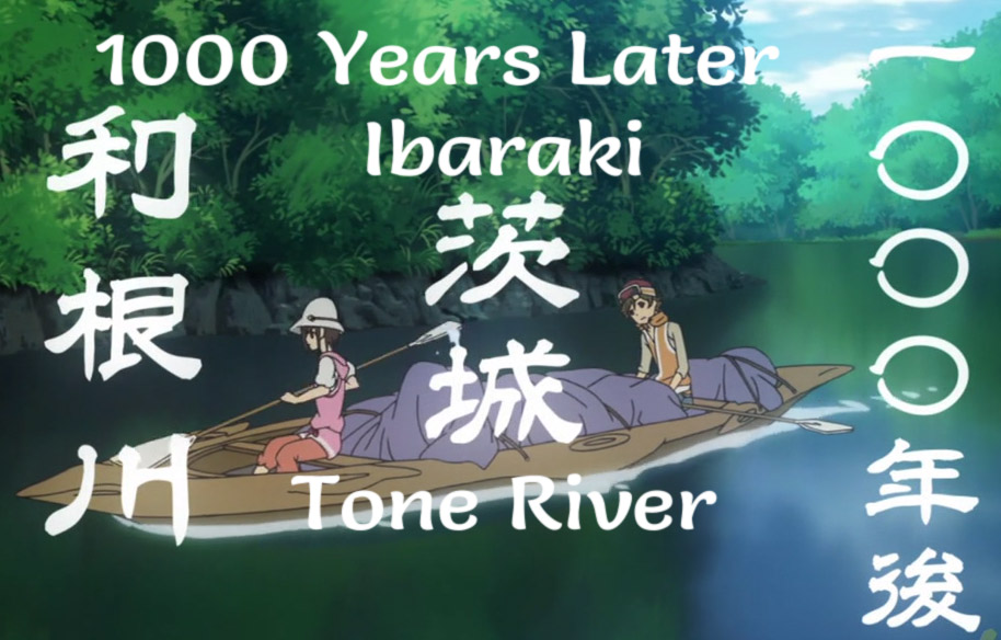 Here the Japanese is a bit closer to handwriting but handwriting or brush fonts would be too messy. The font I used has that varying thickness and the ends of letters fit pretty well. 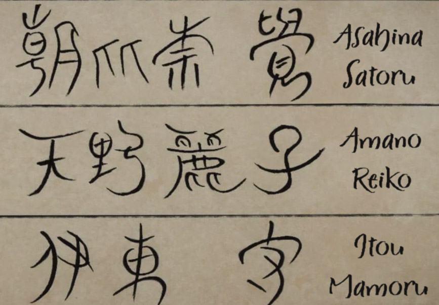 This shouldn't need any comment. 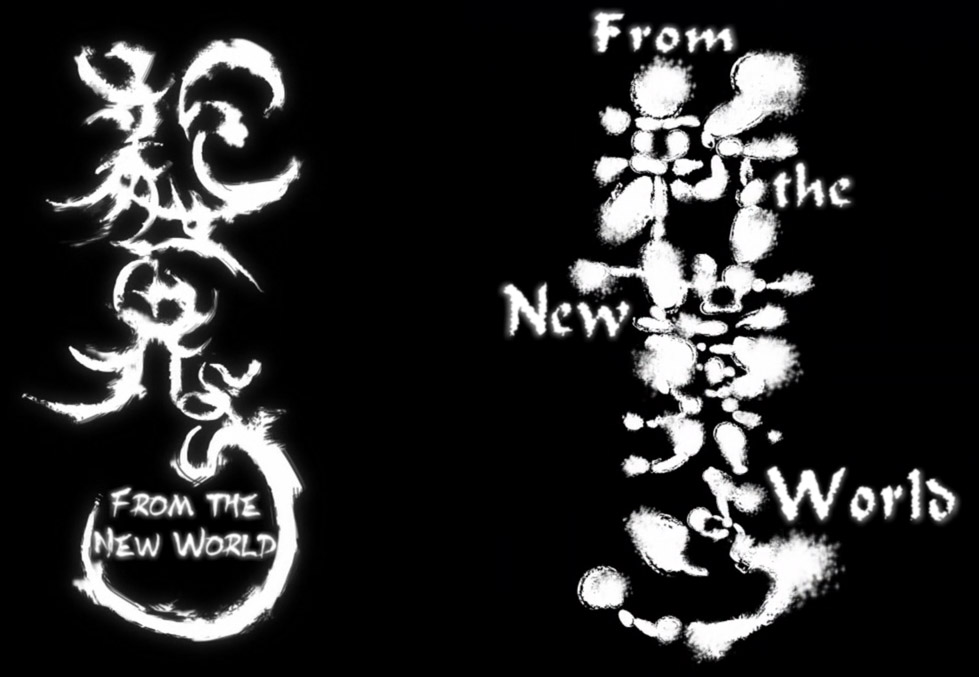 I like typesetting Shinsekai Yori because it has new challenges every episode. These are titles from episodes 1 and 2. 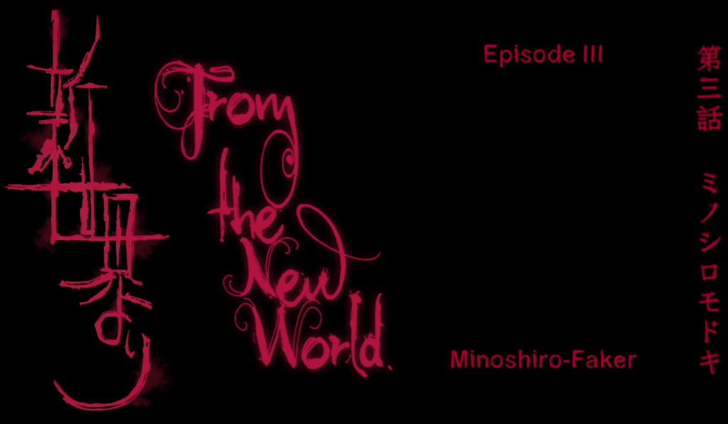 And this is from episode 3. I have no idea how all these moonrunes are even readable. A few examples from Muromi-san: 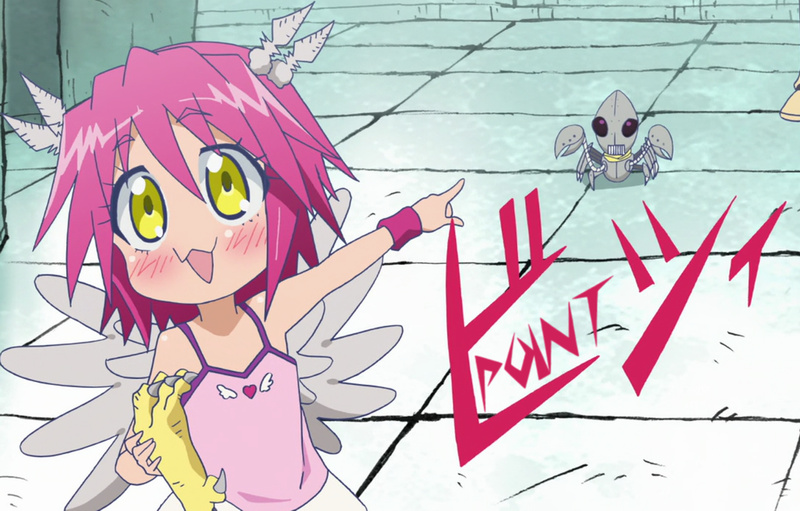 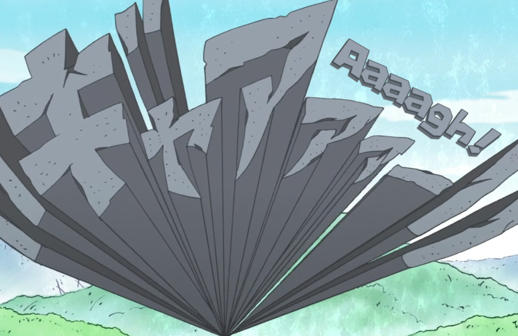 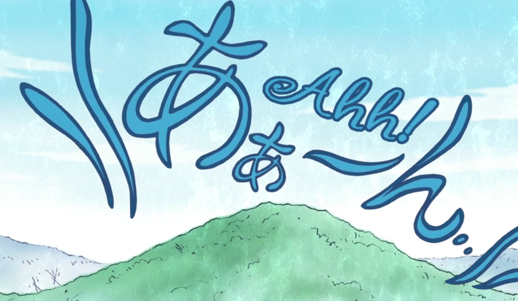 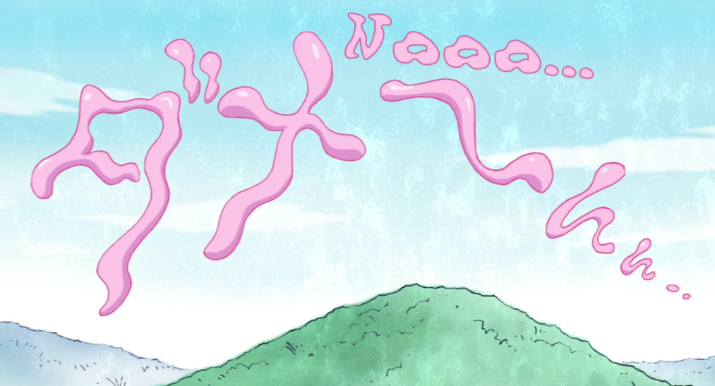 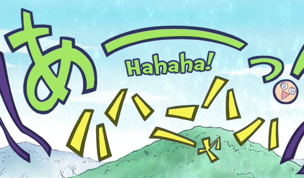 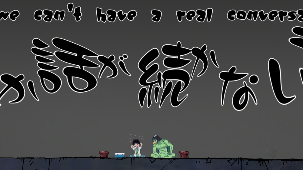 Just imagine how bad they would look with Arial... |