|
|
The first thing you'll want to do before you start typesetting is to create some styles. You do that in the Styles Manager / Styles Editor, which looks like this: 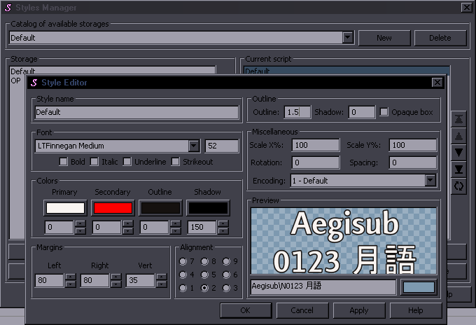 First you need a Default style, which will be used for all the regular lines. It already exists when you open Aegisub, but looks terrible, so you'll modify it. First you need to choose a font. This is an important choice, because you'll be using the font for all episodes of the show and people will have to be able to read it. So you need one that is easy to read, doesn't have any distracting, unnecessary decorative elements, and isn't ugly. It should also have real italics and should contain all necessary punctuation characters [.,!?-—'"]. Next you need a reasonable font size. That is related to script resolution, which will usually be 1280x720. Even if you were in a group that does 720p and Depending on what kind of font you choose, you may want to check the box for Bold, since some fonts look bad in regular mode but good in bold. You will not use Italic for the default font, because that's dumb, and you will most certainly not use Underline and Strikeout, because that's even a lot dumber and only jdp does that. (that actually happened once) Then you have the colours. Primary colour is obviously the main one. I strongly suggest you don't use anything other than white for the default font. You may think something else looks cool, but it won't seem so cool when you have to read it for 20 minutes. Secondary colour is mostly just for karaoke, therefore quite irrelevant. Outline colour is for the border. Again, for the default font, use black or something dark. Shadow colour should clearly be black, because things really don't cast green shadows. Under the colours, you see boxes with zeroes where you can set transparency for each of the colours. 0 is fully visible, 255 is fully invisible. Clearly 0 for Primary (and secondary), possibly a low non-zero value for Outline, if you know what you're doing (but recommended 0), and something in the range of 120-200 for the shadow (still talking about default font), because shadow with no transparency will make you look like some retard who learned typesetting in Hadena. (Check some Hadena releases from around 2011. It's hilarious.) In Aegisub 3.0 and later it looks like this when you click on the colour: 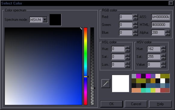 Transparency is the black/white vertical slider and/or the "Alpha" box with the "200" on the right. Margins are important as well. I don't suppose I have to explain why it's bad if the margins are either too small or too large. If you actually need that explained, give up on being a typesetter and save us the trouble of trying to teach you. Reasonable left/right margin for 720p is around 80-110; reasonable vertical margin (that means both top and bottom) is around 30. Alignment is obviously 2 for the default subs. The other ones can be useful for OP/ED. I generally use 5 for signs. Outline / border size. For the default font, don't try to invent anything much. It has to be readable before anything else, so no ultra thin lines, and no crazy borders thicker than the main font. 1.5-2.5 will probably work fine, but it depends on the font etc. Shadow distance. For default font, I don't like using shadow at all, but if so, make it a low value (like 1 or even less) and a lot of transparency. Unlike all the previous values, border and shadow don't have to be whole numbers, so you can use something like 0.6. Scaling. If your font looks good but is too narrow or wide, you can adjust that here. And again, for the default font, don't do anything silly. Rotation. After Spacing. Increases spaces between letters, obviously. For default style, some low values like 0.5 may be helpful for some fonts. Encoding... is probably useful if you're making chinese subtitles. Which you're probably not. So whatever. That takes care of the default font. 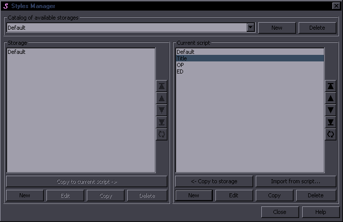 You will certainly want to have more styles than just the default. You'll need a style for the OP and ED and probably for episode titles. You'll create them by simply clicking on New and then it's back to what we've just gone through... starting with a new name. For OP/ED you can divert from the default values much more - all the colours, border, shadow, size, scaling, spacing... are pretty much without limitation. For the episode title, you'll After that, you can create as many styles as you want for whatever you need to typeset. Some people create one style for typesetting and then override everything with tags for each sign. I think that's pretty silly, gives you extra work, and swarms the script with unnecessary tags. I prefer to create a separate style at least for each font I'm gonna use, since it's a lot more convenient than changing the font with tags. And obviously if there are certain kinds of signs that are used repeatedly throughout the show, it's good to have a style for each of those. How many styles it's useful to have depends on the amount and type of signs in whatever you're typesetting. Sometimes you'll want 2 styles for the same font. For example one black and one white, or one with border and shadow and one without. If the episode has 20 signs with that font, 10 of them white and 10 black, I'll create 2 styles rather than having only a white one and using the \c&H000000& tag 10 times. To do that, you create one style, then click on Copy, change the name and the one thing you want different, like colour. This can be used even for alignments. When you have the same kind of sign 10 times on the left and 10 times on the right, you can have 2 styles rather than typing \an? 10 times. After all switching styles is easy: 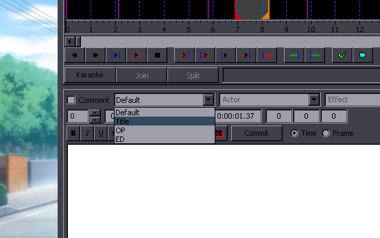 One last note. Pay attention to what fonts you're choosing. Remember each font has to be muxed into the mkv, so don't pick 10 MB fonts. Any font, even a fancy one, should be under 1 MB. The only exception is if you need to use kanji. From the list of fonts in Aegisub, avoid those that start with @, avoid those that have Adobe or MS in the name, as those are likely to be huge. |