|
|
Aligning signs is actually pretty easy, but for some reason many typesetters fail in this area all the time. I'm not sure if they don't know how to do this or they're just too lazy to do it right, but it's pretty lame because just aligning the sign correctly will make it look a lot better. The tags you use for this are the three rotations - \frz, \frx, \fry, shearing - \fax, \fay, and to get the \frx and \fry right, the origin point of the rotations - \org. Let's try a basic example. Let's say you want to put a sign on this balcony: 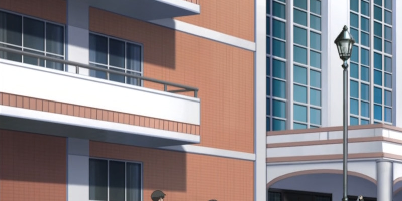 This is pretty typical for anime. You will need to make lots of signs of this type, whether it's the notorious nurse's room at school, a sign above or on the door of an office, or various signs on buildings etc. These signs usually have a horizontal slant, but vertically they're pretty much straight. This is important to acknowledge if you don't want the sign to look like shit...  This could be the first thing to do - use \frz to rotate the sign. Unfortunately that's where some typesetters end. If you can call them typesetters. It's the same people who will also pick an incredibly shitty font, often some M$ or Adobe nonsense that looks like crap but is 10 MB large. Anyway, we'll get to fonts later... So if you actually want to do some real typesetting, here's the next step... 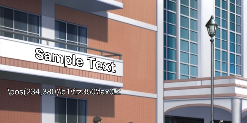 The tag you use here is \fax. When used with a negative value, like \fax-0.1, the effect is like using italics. With positive values it leans in the other direction. You have to use low values, usually in the range of 0.05-0.5. It seems that many typesetters don't even know this tag, or are too lazy to use it because unlike the rotations, this one doesn't have a tool in aegisub and has to be typed out. (lol typing tags) It is, however, more useful than \frx\fry, because anime doesn't have much of 3D effects. Most of the time it's really just horizontal slant while vertically it stays the same. So now you have a sign that's fairly well aligned. Now you just need it to blend in a bit better... 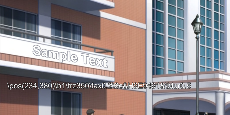 ...which you achieve by changing the colour to match whatever is relevant in the picture. Here I don't have an original sign to imitate, so I just go with the outline of the balcony. You will also notice that i used blur. On signs, using at least 0.5 blur is a must if you don't want them to look obviously added and out of place. So now you have a pretty decent sign. You might as well go with it. If you look more carefully though, you'll see that it's aligned to the bottom of the balcony but not the top. Why is that? Well, because here you actually have a sort of 3D effect, where the left end of the balcony is taller than the right. So what now? Since we've gone this far, we're not gonna redo it with rotations, so we'll use a simple trick... 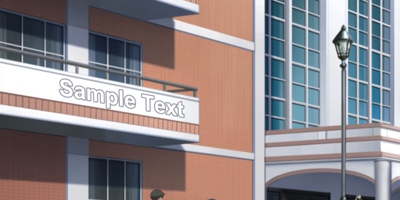 Looks better, doesn't it? (By the way if you don't see the difference here, you should probably not be a typesetter.) So what sorcery is this? Very simple. The original font size was 50. If you want the end of the sign to look smaller than the beginning, instead of all kinds of rotating and skewing you can do this... Sa{\fs49}mp{\fs48}le {\fs47}Te{\fs46}xt (Did you know HYDRA can do gradient by 2 characters? No typing required.) As you can see, after each 2 letters I decreased the font size by 1. If you're learning to typeset, this should be good enough. If you're pro, you'll notice the end of the sign is still a bit too tall, the 'p' is too close to the bottom etc. And obviously you'll want something better than Arial. Then again if you were a pro, you wouldn't be reading this guide. So we have what we wanted, but let's look at other ways of doing this. 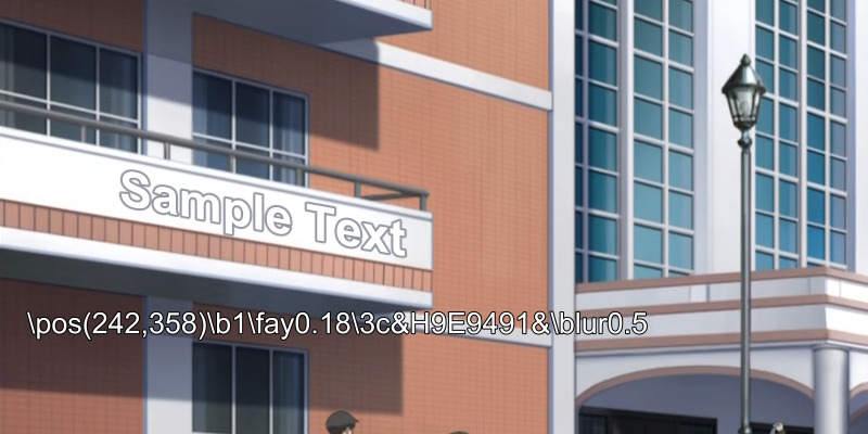 This is without using \frz and \fax, but using \fay instead. Often this is more convenient because you don't have to use any rotation. It'll work fine for signs on/above doors much of the time. The problem with \fay is that you can't use additional tags in the text like I did for the font size before, because of a vsfilter bug. The last way to do this that I'm gonna mention, possibly the most pro if you can do it right [but epic fail if you can't], is using just the rotations and moving the origin point. This means we're gonna use \frx and \fry, instead of \fax and \fay and do it right. Why would I do that when I've described how \fax\fay is a lot more convenient? Because the rotations actually can give you a 3D effect when you need it, and we've noticed that the balcony here is "closer" on the left. We've managed to bypass it pretty well with the font size, but that may not always work. Like when the sign is only 2-3 BIG letters. First let's look at what will happen if you use rotations without moving the origin point. 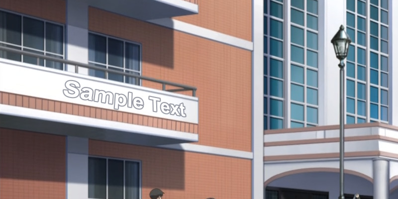 You'll see many "typesetters" create these abominations. It's possibly even worse than our first example in black colour way above. What you have here is a sign where maybe 2 out of 10 letters are aligned somewhat correctly. The rest is FUBAR. This is like "I has Aegisub so I can into typesetting yeah?" Nope. You can't. So what now? If you try playing with those rotations, you may find out that no matter how much you rotate it around, it just doesn't fit. It will always be aligned at one end and not the other. Why? Because if your default alignment is \an2 or \an8, it will always align to a vertical line that goes through the centre of the sign. That means both sides of the text will lean towards the centre, like you see above. Now if you use \an1, 3, 4, 6, 7 or 9, you may get slightly better results, but still pretty derp. So what you need is to move the origin point. The tag is \org(x,y), but you can use the rotation tool. You'll use the tool for \frx\fry and rotate slightly to the side - like \fry7. Usually you want to use only a little of these rotations and get the rest done with \org. If you use too much, you'll get too much difference between one side and the other. When you adjust \fry, you grab the triangle in the centre of the grid and move it. In the tags, you'll see \org appear and you'll notice the sign changes alignment as you move it. Then you just have to go and find where to drag it to make it align right. It may often be off the screen. Once you go off the screen and let go, you won't be able to grab the triangle again but you can adjust the numbers in the tag. But since that's inconvenient, try to learn to get it right the first time by dragging. Now, you'll notice that while this will let you get the alignment right, it may drag the whole sign away from its position. This is not a problem, you'll get it back, just get it to align right first. When it seems fairly good, you switch to the Drag tool. You will now see 2 points you can drag - the regular square and the triangle. You won't see the triangle if it's off the screen, but the red line will tell you roughly where it is. So now you drag the the sign back to position with the square. If it misaligns the sign, you need to drag the triangle a bit again. It may take a while to balance them out, especially if the triangle is off screen & you have to change the numbers in the tag or try again. With a bit of practice though, you'll learn to do it more easily. More importantly, you'll get some good results... 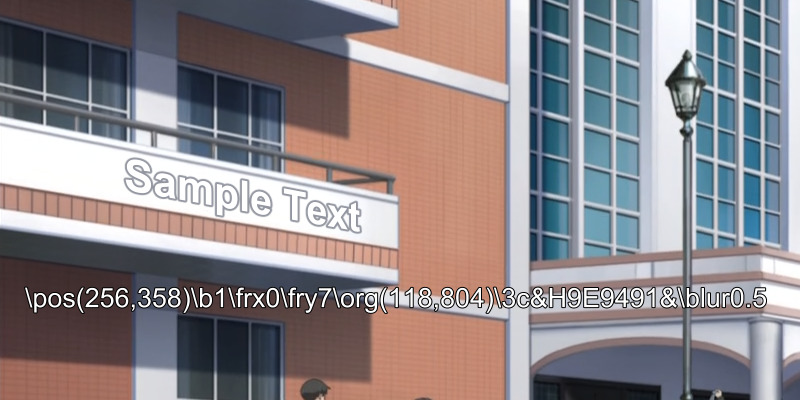 You can see that the sign looks pretty good and the only tags creating the alignment are \fry and \org. (\frx0 can be deleted, it's just that the tool adds both tags even if they're 0) The script resolution is 1280x720 so you see the origin point is off the screen in this case. This method is especially useful when you need to do something more complicated like you'll see in the last example at the bottom of the page. Of course you can still fine tune this using \fax and/or \frz. You may use various approaches and combine the tags as you wish. For static signs \fry\org may be the best, but if you need the sign to move, you can't use \org, so go with \frz\fax and possibly scale down the font size for some perspective if needed. 2018 addition: So I had this sign in this week's Hinamatsuri:  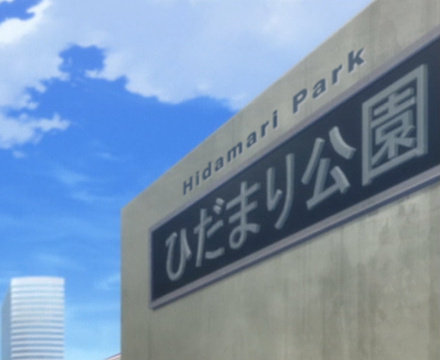 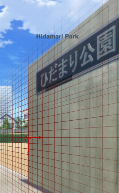 You'll come across this kind of sign fairly often, and it can be a pain in the ass. This was what I did. (above)
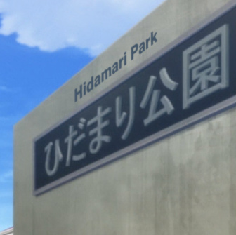
I went with \org and \fry, but I'm not sure if that was the best idea. There's more about how to do signs with \org in this blog post, but here I'll explain the other option: \frz and \fax. Many people would think this is not the sign to use it for, but the available tools have significantly improved, and it can actually be done quite easily and without much hassle... as long as you know how. I'm gonna use the alignment grid here, but it's not really needed (and is the most tedious part of this). I'll include it because this is a guide, but skipping it would save you some time. Below is what I start with. I use Masquerade to get an alignment grid on a separate line. 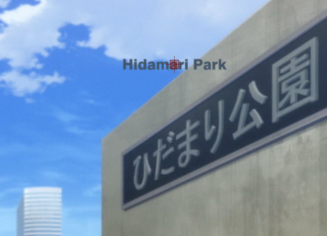 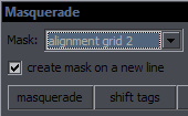 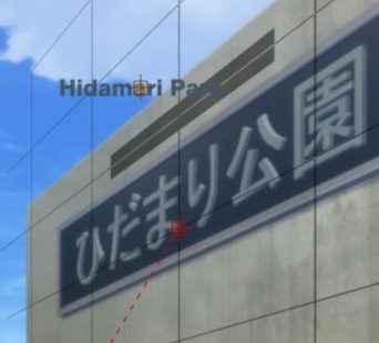 On the right, you can see it being aligned with the wall
with the inbuilt rotations tool. That's the part where you have to tinker with it a bit, but you can see both top and bottom of the wall, so it's not that bad. Once it's aligned, I move the dark rectangle to where I roughly want the sign. (left image) The only use for the grid here is that it can guide me for drawing the clips, but it could be done without it. 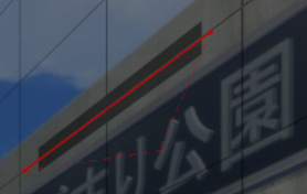 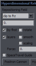 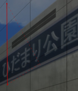 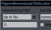 So now I need to rotate the sign and set \fax. This only takes a few seconds. Draw two points with a clip for horizontal alignment, and use clip2frz from Hyperdimensional Relocator. This sets \frz. Draw another two points for vertical alignment, and use clip2fax to set \fax. (Also in NecrosCopy) 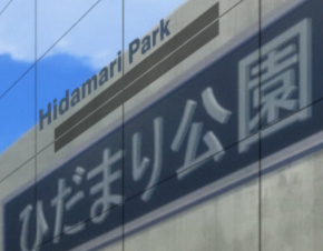
 The result is on the left.
The one issue you need to realise is that if you draw the horizontal clip along the Japanese sign, the rotation will be slightly different. To be precise, for the top of the JP sign it's \frz34.8, and at the top of the wall it's \frz39.4 - a noticeable difference. So you need to be somewhere in the middle, thus drawing at the grid mask. But you could just draw the line in the middle between the sign and wall top and get it accurate enough without the grid, so that's why I said the grid wasn't necessary. Also, I had totally forgotten that clip2frz can take average of two lines, so you can draw one at the top of the wall and the other at the JP sign, and the script will use the "midlle line", i.e. the average. Just remember to draw points 3 and 4 in the same direction as 1 and 2. (Like a "Z") The vertical clip can be drawn at the edge of the wall or edge of the screen. So on the right, you can see the result put in place, with the grid now removed. The alignment is now good, but the remaining problem is that the font size is constant, while it should be larger on the right. 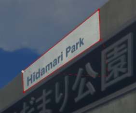 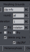 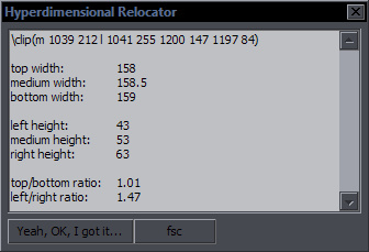 So here we use the clip tool one more time. Draw a rectangle roughly around the sign, with the left and right sides more or less vertical and the top/bottom lines matching some edges. The idea here is to get the difference in size between the left and right sides. The width of the clip should roughly match the width of the final sign. (Thus larger than the text here.) Once you have the clip, use Relocator again, this time the "clip info" function. What you get is a bunch of measurements from the clip. The one that interests you here is the last one, the ratio between the left and right heights. It's roughly 1.5 here, so the last letter should be about 1.5 times larger than the first. This info would be enough to do the rest, but for convenience, the "fsc" button will help. It takes the starting values of \fscx\fscy, multiplies them by 1.47, and sets \fscx\fscy tags before the last letter in the line, thus preparing it for gradienting. 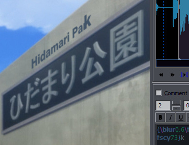 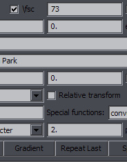 As you can see, there's "fscy73" visible before the last character. (I had scaling at 50 at the start.) You can either use lyger's GBC or, as the second image shows, use HYDRA, set "fsc" to 73, and click on Gradient. (Make sure "by character" is selected.) 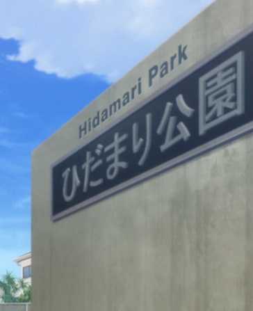 And that's it. Now you can just make some final cosmetic changes: tweak colour, alpha, blur, shadow, or whatever makes the sign blend in better. If you feel like the letters are too tall or too wide, you can change \fscx or \fscy. The inbuilt tool won't work because you have a gradient, so you use Recalculator. If you only change x or y, it will throw off \fax, but you fix that in 5 seconds with clip2fax again. (BTW, if you make 4 points for the clip, first 2 points left side, second 2 points right side, each side determines \fax for that end, and a \fax gradient is created.) So if we skip the grid with the rotations, this is all pretty simple and no \org or messing with the rotations tool is needed. To recapitulate: 1. two clip points -> clip2frz -> you have rotation 2. two clip points -> clip2fax -> you have the whole alignment done 3. rectangular clip -> clip info -> you have scaling set up 4. gradient the fscx and fscy All 4 steps done in under a minute. (I just tried it - took about 40 seconds.) The rest is just colours and stuff. One more thing regarding that sign. It's one of those where you think about how to do it not as much in terms of technical approach, but more in the sense of what you really want the result to look like. Should I try to fit small letters on that blue plate? Should I replicate the whole plate and make an English copy? (This is dedicated, but nobody would solve it that way in real life, so it's bound to look stupid.) The way I chose to do it, what should the colour really be? Light grey? Dark grey? Blue? There's basically no way to make it look natural. If in real life they wanted added English, it would be on the blue plate but certainly larger than you can fit here. I suppose enlarging that plate for that is an option too. Enjoy the gradients. So really, sometimes I wonder if it's better to just do something like this: 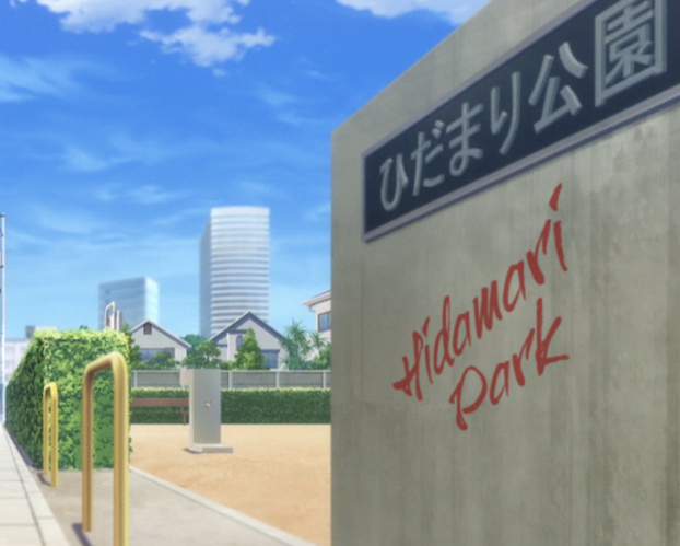 After all, the notion that somebody just sprayed it on the wall is a lot more realistic than the sign I did before. And you can wing all the rotations and not bother with any measurements. Anyway, to make a final point, in the vast majority of cases, between \org\frx\fry and \frz\fax\fscx\fscy, I would recommend the latter. (And you usally don't need the scaling.) Let's move on to something a bit more advanced. Another week in Hina...  I'm sure you love when you get one of these. This episode had 40 signs (counting this as one), so I already had plenty to do, and I knew this one would take a while. And it did. I did it all the tedious way, splitting into words, adjusting positions, rotations, \fax, colours, and making two layers for glow. I actually did it more tediously than I had to because I guess I wasn't thinking too straight at 1 am after 3 hours already at it. But this is what propels my script writing. This was the most annoying sign in the episode, so I figured I needed something to do it more easily. So I thought about it, and the next day, I wrote something that was surprisingly easy and turned out to work better than I expected.  What I'll be using here is NecrosCopy's "Split by \N", which I improved for splitting along a clip. Now, line0 has this MoveAlongPath script that does something like that. I've never seen/used it, but afaik, it splits into letters along a curved clip. Which is great and probably quite precise, but here I have 200 characters and 2 layers. I don't really want 400 lines for this. So my idea was to keep the splitting to words, but somehow position and rotate each easily. You already know how to do the \fax thing. So I take the line and put it somewhere that allows me to draw the clip. I want to draw the clip along the grid line, which will guide me. I can move the text above it later. I set the size and rotate the text to get the closest alignment I can with a straight line. 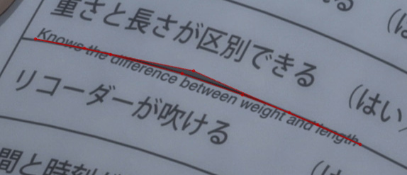 You need to see the text while you draw, so either duplicate the line, or convert the clip to iclip right after making the first point. What you do then is make points at the edges of words, like you see above, going along that grid line. (That one point above "be"[tween] is an extra last point, just so i could see the words better.) The text should have centre alignment (\an5 or 2 or 8), so \an5 will be set no matter what you have there. What the script will do is set position for each word to the centre between the 2 clip points around that word and also set the rotation based on that segment, like with clip2frz.   Now you simply run "Split by \N" and have it split by spaces, and the image above shows the result. Then you drag the text to the right position.  Last tweak is to draw a clip line along the left edge of the grid and use clip2fax. And that's it. I don't think the alignment needs any more work. For long words, you might split them in two or put a frz tag in the middle and rotate each half slightly differently, but in most cases, this will do. And it's probably about 5-10 times faster than what I did originally. The clip must have as many points as there are words, plus one. Words joined by dashes or something will be considered one word, as we're splitting by spaces. If you have something like I had, "rock-paper-scissors", just put spaces before or after the dashes, and you will nudge the words a bit when it's split. The inaccuracies won't be significant. A few examples of signs I've found in some groups' releases... (These are from aroud 2011 and before. We've gone a long way.)  On the left is the original sign, on the right is my quick adjustment. Clearly this looks bad and totally out of place - alignment is terrible, even the \frz isn't quite right. You can also see the colour is off. I didn't like the choice of font either but that's the least of its problems. Even my sign doesn't look too great, but at least it doesn't look retarded.  While in the previous example it was only \frz and good-bye, here some "pro" went for \frx and \fry, clearly without a clue how to use it. It is sad, because it only takes a minute to do what I did on the right. Whoever did the one on the left should be fired. I wanted to just quickly fix this to make an example so I went for \fay. If I actually wanted to release this, I'd use \frz and \fax, and then change colour after every 2-3 letters to match the change of colour on the japanese sign. 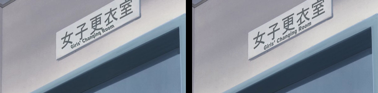 It just keeps happening, doesn't it. I'm not sure why groups that have been around for years have problems with this. 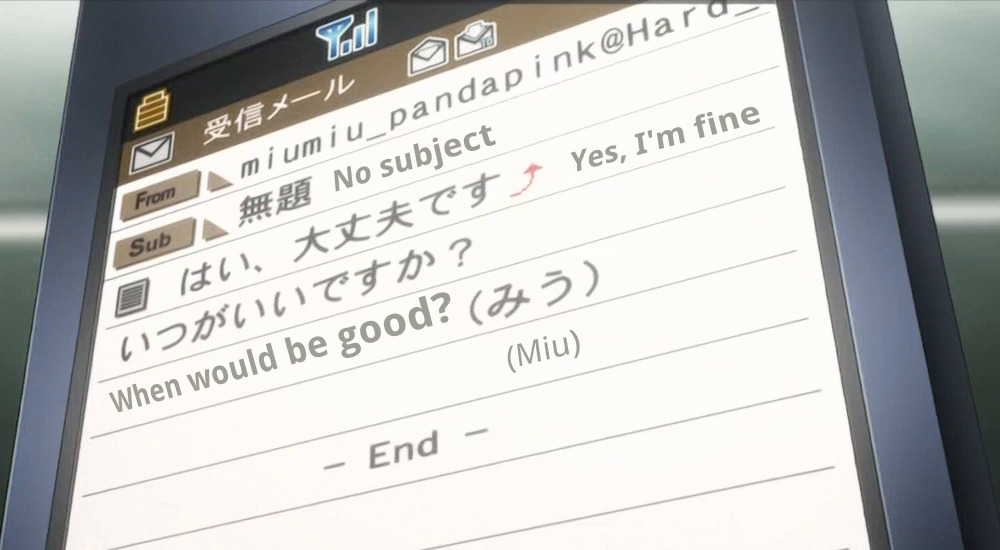 Now this... is admittedly not an easy one, but this implementation is pretty poor, especially with each line having different (mis)alignment. The "When would be good?" line is so bad that I'm guessing the author must have been in quite a hurry to finish this. Here's where \fax and \fay won't be enough and you'll have to use rotations, and you'll have to use the \org tag, if you really want it to look good. 2018: No, fuck you, younger me. No \org, just \frz and \fax. Scroll down... One other thing you'll have to use is blur. Its lack in the one above makes it even worse. And the colours are off as well. It will certainly take more than a minute, possibly even 10-15 minutes to get all the 4 lines right. But hell, if you look at the one above, and the one below that I made, you'll have to admit that it's worth the time. 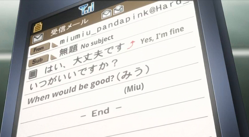 2018: So I saved the image, loaded it in Aegi, and redid the "When would be good?" part with \frz\fax. Two minutes or less. 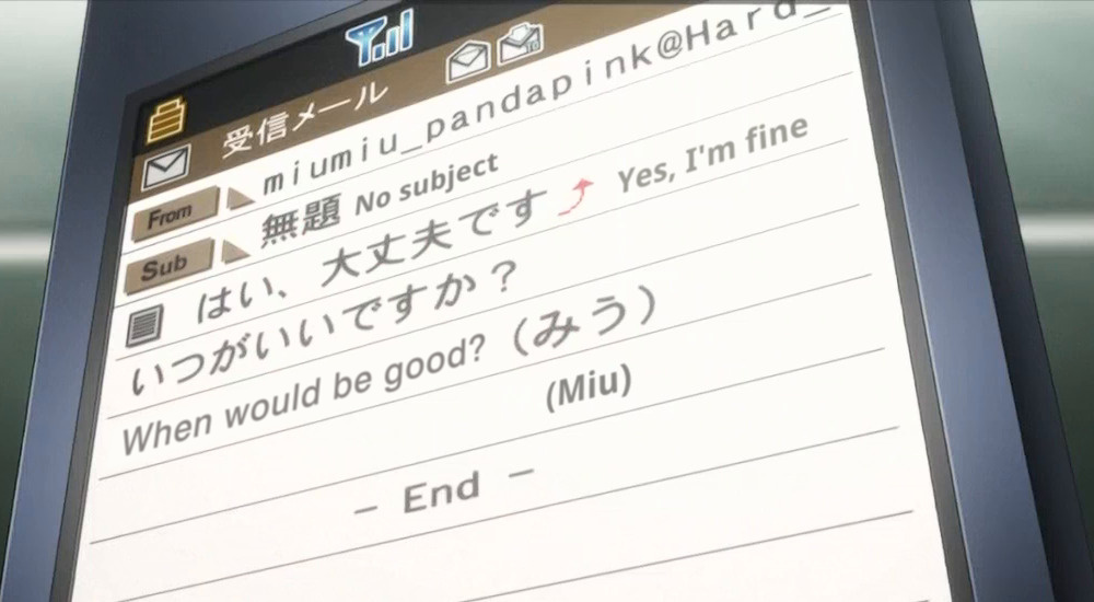 |