|
|
There are several things that determine how good a typeset is and how well it blends in. Obviously, the colours and sizes of font, border, shadow. Then of course the choice of font. The next thing would be the positioning of the sign. Beginners will have this idea that the typeset for a sign should be as close as possible to the original sign. Please get this idea out of your head, because half of the time that won't work very well. It is especially unnecessary for typesetting titles. If it's a sign that belongs to a specific place on the screen, then sure, you wanna get your TS close to that. But an episode title has little relation to what's on screen in terms of placement, so no need to go crazy trying to match the position and orientation of the sign while sacrificing readability. I used an episode of Nichijou for a test. Here are the results from some guys. 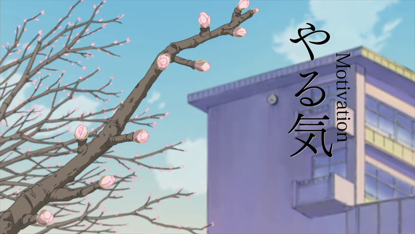 Kanji is often written top-to-bottom, rather than left-to-right. It works great with kanji. It does not with English. So don't try rotating the text like this just to match the orientation of the japanese sign. It decreases readability and doesn't really look that great. You might think of using M\No\Nt\Ni\Nv\Na\Nt\Ni\No\Nn. In other words top-to-bottom, without the rotation. Well... try it. For one, you will usually have large spaces between the letters. But even if you pick a font that doesn't do that, or do each letter separately, you'll run into another problem. Kanji has pretty consistent width. English letters don't. The difference in width between M and i can be anywhere from 500-1000%, depending on the font. So this will usually not work either. Also here ^ the white 'shadow' is missing. 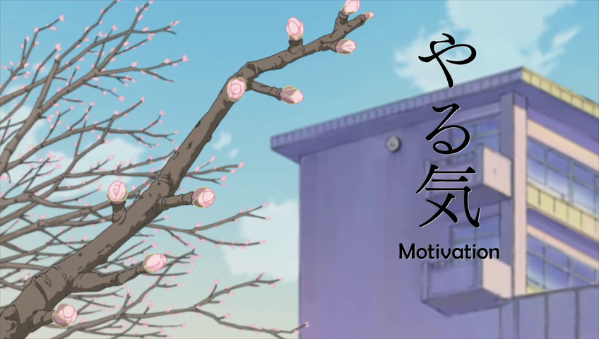 This is pretty good placement. It's much better to sacrifice font size and orientation if the result is well readable and looks good. The shadow is a bit too thin and jagged but this is overall fine, except that the font should be a serif one. 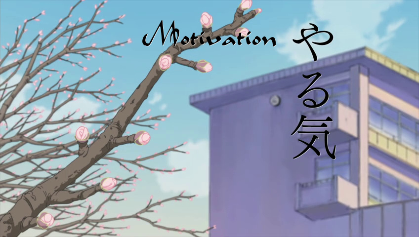 You can do something like this. Pick a font that will look good, you can make it large enough so that it's both readable and close to the size of the kanji, and keep at least some kind of alignment when posotioning it, in this case the top aligned with top of the the kanji. 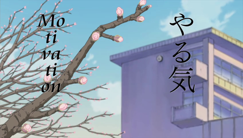 You can even put it on the other side of the screen for overall symmetry. If you want it top-to-bottom, it may be better this way than rotating, but I'd say it's almost always better to keep it left-to-right. Trying to split the text like this will rarely work well for a number of reasons, like the width inconsistency that you see here.  Another title. Here I think if the font was larger, to match the span on the kanji precisely, thicker, and placed a bit farther, it might actually not look too bad (putting aside the readability issue)... 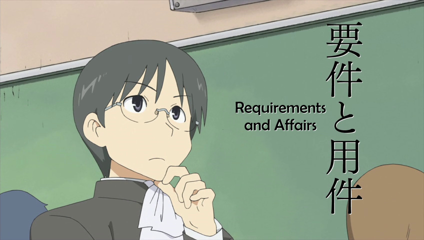 ...but clearly this works much better. It's aligned to the centre of the kanji, looks fine except for the font. 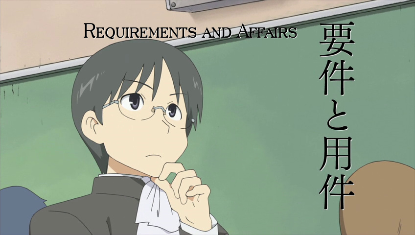 Here aligned to top, with a different font. There's never one "correct" place for typesets. Rather than following some rigid logic for where a sign should be, just make it "look good." It doesn't even necessarily have to be aligned with the original sign in any way. 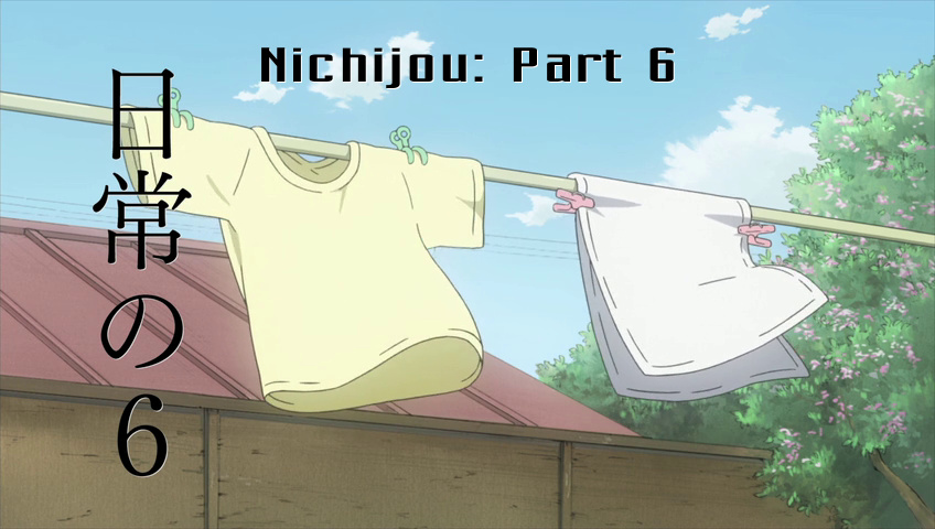 Here it pretty much ignores the JP sign. Instead it's in the middle of the "background" area - the sky - where it doesn't interfere with the foreground. It's kind of where you'd put it in the first place, if the JP one wasn't there at all... pretty much the most natural place for a title on this screen, assuming the title is horizontal. 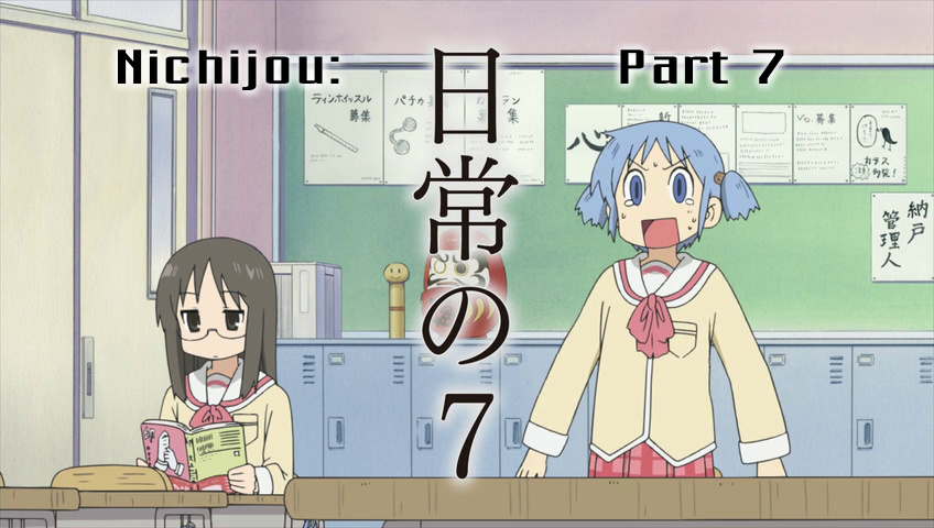 If the JP is in the middle and you can't exactly fit the typeset in the middle as well, you may split it like this (if the words allow it). 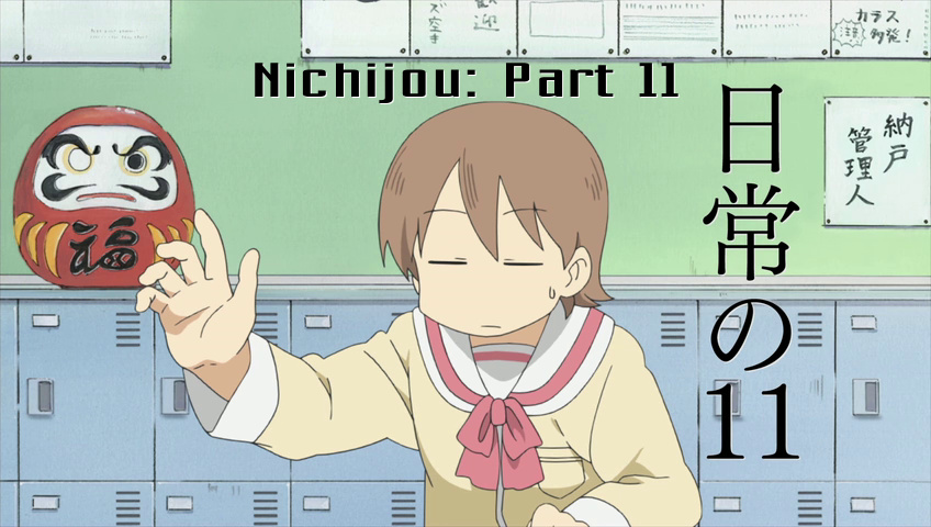 This should be pretty obvious. You don't want the sign over Yukko's head, and you don't want it over the papers above either. The neutral green area is the most suitable place. If you split the title in 2 lines, you could put it in the large green area on the left. 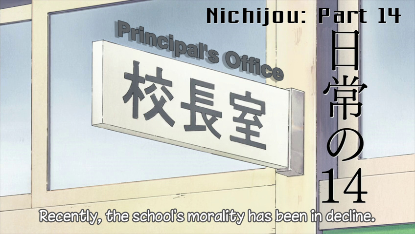 Here you have 2 typesets and main dialogue, so first of all you want to avoid any of them overlapping. The title is where it is pretty much out of necessity. There's hardly any other place suitable for it. The office sign... many would try to fit it on the white board, along with the japanese. That can certainly be done, but you'll have to have really small font size and it'll still look cramped. So I put it above, and matched the width of the sign and thickness of the letters roughly. It looked too artificial without that shadow, so that was added to give it some sense of space, even though as a "shadow" it's illogical. 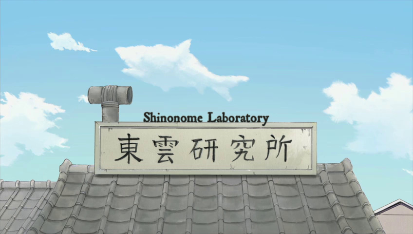 Here again trying to squeeze the Shino Labs on the signboard would be frustratingly difficult & just wouldn't look good no matter what. On an unrelated note, did you know sharks can fly? Anyway... One other option is to simply replace the JP sign with the English one. That will, however, only work well if the background is one solid colour. Here's one where it will be simple enough: 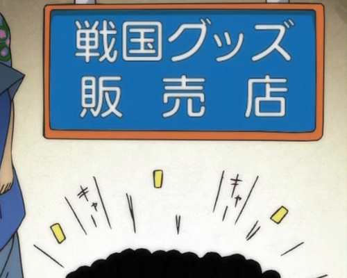 You'll be creating 2 layers. One will just draw a blue rectangle over the kanji. The other will put the English text over it. Normally I make the actual sign first. Then I duplicate it and delete content. Then paste this instead: {\p1}m 0 0 l 100 0 100 100 0 100{\p0} 2018 Note: No. Make the sign. Use Masquerade. One click. That's a basic square in drawing mode. Nuke border/shadow if present. Expand it using the scaling tool (\fscx\fscy) to the size needed to cover the kanji. Add \blur1 to make the edges softer to prevent them from being noticeable. Match the blue colour and adjust layers so that text is on top of the rectangle. The result will look like this: 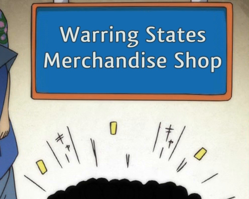 (i.e. like shit because text has no layers for blur) And just in case this was difficult to comprehend, here it's disassembled: 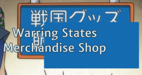 You could create more complex shapes than a rectangle. More on drawing and other stuff in this section. Here I want to show how the sign doesn't always have to be in the most obvious place, right next to or under the Japanese. 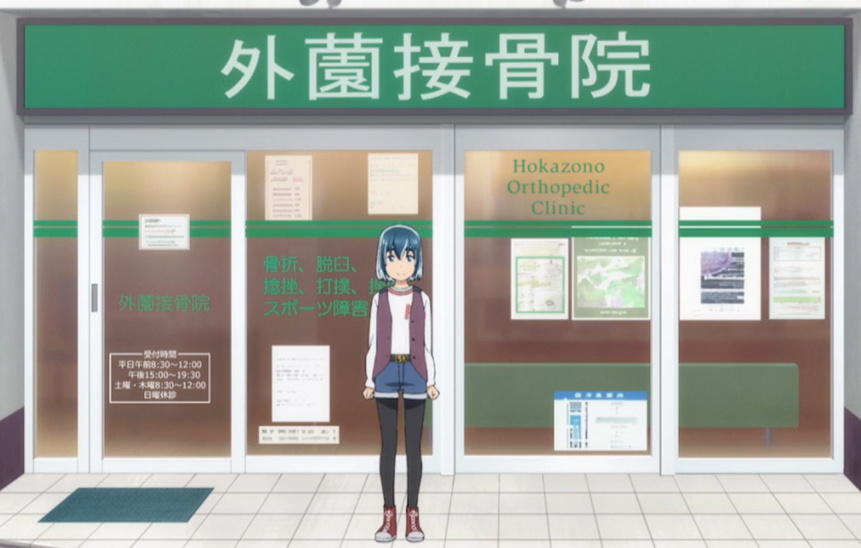 The sign is for the white letters at the top, obviously, but what to do with that? Doesn't fit under, and while there's space on either side, putting the text on one side will make it asymmetric and awkward, and putting half on each side is gonna look weird too, especially since I have three words. So instead, I look around and see what else can be done. The glass has some posters and inscriptions on it already, and there's enough space. They already have green letters on some of the glass, so it won't look too strange if I add some more. When you glance at the picture, nothing looks out of place, but the sign is there, easy enough to read. 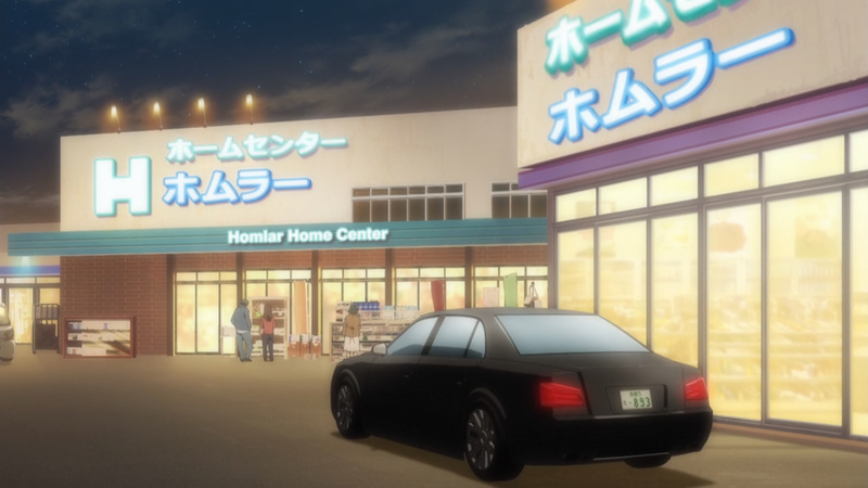 Here you have enough space and even a few choices for where the sign could obviously go. But I tried to typeset it at the wall above, and it just didn't look too good. It looked like nobody would really put the sign there. So I went for "a different spot from where the Japanese is" but one that might actually work in real life. Enough space there too, easy to do, and I think it looks pretty natural. 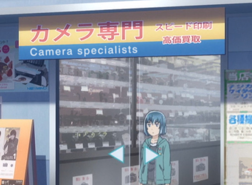 So the sign is red with white border, right? So you should probably do that? Well, maybe, but it's also on yellow background, and trying the same on blue will not look the same. You could use the space above the Japanese, but the space below is larger, so it would feel strange that somebody used the small space and ignored the larger one. It's nothing strange that different parts of a sign are styled differently, so I just wanted to do whatever would look OK on that easily available blue stripe. Just for the sake of comparison, I tried the more obvious choices. 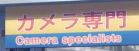  Matching colours, but staying in the blue area... and tweaking the colours a bit by eye. Doing the same stuff on different background usually doesn't work too well. 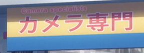 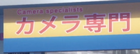 Now at the top, matching the colours first... and tweaking them by eye again. The first one is fucking horrible, even though it "matches" the Japanese the most of all these. (Thought it doesn't even look like it matches, but that's the colours from colour picker.) The second one blends in better, but it has several problems. 1. It's barely readable, especially compared to what I did. 2. It spans over slightly more than half of the Japanese, which just looks dumb. 3. It uses a relatively small area in the corner while there's plenty of space elsewhere. I'll leave it to you to decide which one of the five looks the least terrible. 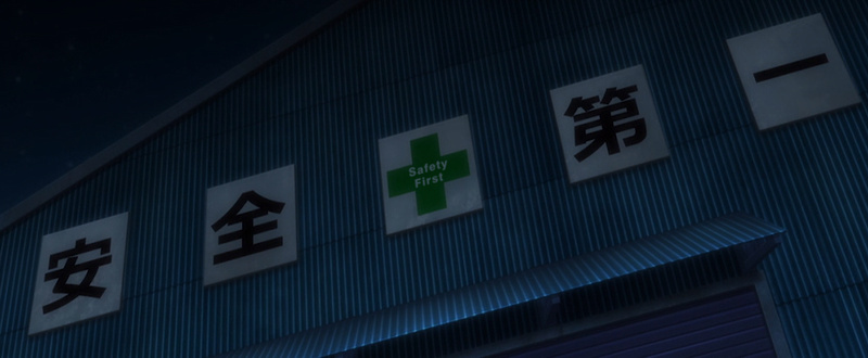 This is another example where I quickly decided that trying to put the TS close to the Japanese is never gonna work. Once you make that call, then pretty much anything goes. Instead of "matching stuff", it's more about: 1. making it visible and readable enough 2. doing something that could plausibly happen in real life (3. choosing something that won't take you an hour to do) I suppose you could do something on the striped area around, but that would go against point 2, unless you do something really magnificent, which will probably go against point 3. Some typesetters would try to replicate the grey blocks and maybe place one above the green cross, but again, that wouldn't happen irl, and the blocks are like 120 shades of grey and not even in a gradient manner. I thought about putting the words above and below the "hyphen" on the right, but there's that weird asymmetry again. So I chose pretty much the most symmetric solution possible that also happened to be really easy. As you saw on the examples with the camera above, the eyedropper doesn't always work well, so just getting the grey from the block probably won't be that great here either. You have to tweak it by eye, but it should be clear that the grey basically needs a tint of green, because it's on green background. From the typesetter's point of view, this is a good sign because: 1. it looks OK 2. nobody really gives a shit about where the sign is as long as they can read it 3. you've only wasted 2 minutes tops of your life on this (well, aside from the 5 minutes spent thinking about what to do) |