|
|
So what remains is clips, animation, drawing mode, and using all the things together. \clip The clip tools are under the rotation and scaling tools in Aegisub. In principle they are simple. You have a sign, and you want only part of it to be visible, so you use the basic clip tool and draw a rectangle over the area you want visible. You'll get somethnig like \clip(54,25,380,110) in the tags. That's the coordinates of the visible area. Rather than this part being visible the idea is the other part not being visible, so it doesn't matter if you expand it to empty areas. It can look something like this: 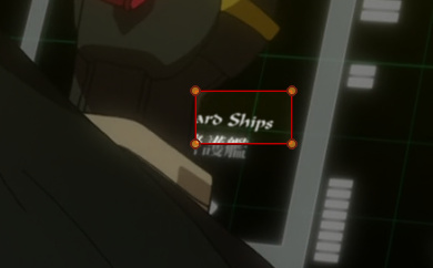 < with / without the tool selected > < with / without the tool selected >
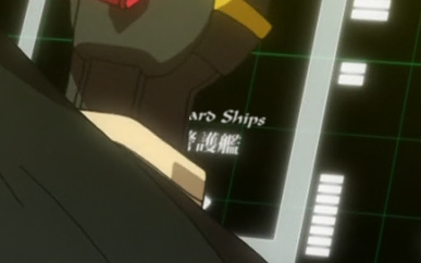 If it's a pixel off, you can either drag the orange dots or type in the tag. Typing without the tool selected may be better as the red lines won't be in the way. Obviously, a rectangle won't always do, so you have the other tool that lets you draw a more complex shape. There's also \iclip, which does the opposite - selects the area that will not be visible. No special tool for that, so just add the i & adjust coordinates by typing. \clip has more compatibility, so I use that one wherever possible. (Scripts handle easy conversion.) That's the basics of using clips, so now for the drawing mode. You should already know how it works from ASS Tags. Drawing is useful when you need to cover some area with solid colour and put a sign over that. I have briefly described that in the Positioning Signs section. I rarely use any complicated shapes with this. Usually only square or circle. Shape can be adjusted with the scaling tool. If I need a specific shape, I draw it with the clip tool and use a script to convert it to drawing. Normally I use the drawing mode only for masking. Using the basic rectangle with \fscx\fscy\fax\frz i can usually get what i need. Here's what you can do with it, if you feel like spending 5 hours on 1 frame: 
Some colours of the masks are off because back then I didn't know about the issues with colourspaces and used ffmpeg in Aegisub 2.1.8 or 2.1.9. If you're using those versions, use avisynth to load the video. If you're using Aegisub 3.0, use the BT.601 colourspace [which I think is on by default]. 2015 Note: And if you're reading this, do NOT use BT.601. (Turn it off in Options-Advanced-Video.) Yeah, shit keeps changing. In case it wasn't clear to someone, all the books had Japanese titles, of course... 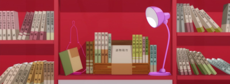 So it really was 5 hours of pretty tedious work. I don't recommend that you ever try that. Unless you like... don't need hands for the rest of your life. Each book has one typeset for the title with matching colour and size, and a mask in the colour of the book to hide the JP title. Sometimes there are additional ones for the numbers. Here's what it looks like in working mode. I think it's almost 200 lines.  OK, but back to a bit more sane things... If you need a rectangle with round edges, or even a circle, you can still do it with the basic square. For rounded edges, use border with a value as high as you need to get the right shape. \bord20 or \bord30 may be useful values. Of course you need the exactly same colour for \c and \3c. To get a circle, you do the same but scale the original square down to 1 pixel. You can actually use this with a regular font. For example if you use a period with \bord50, you get a pretty good circle. You can use the letter O for an ellipse or whatever else gives you a shape you need. Just match the primary and outline colour and it works. Speaking of that, sometimes you need a mask with a slight gradient. Well, you might need a strong gradient but then you'd have to use an actual gradient and have hundreds of lines... But for a mild one, you can actually use some symbols from a font with large border. For example in one Nise ep I had this sign:  The background on the left is darker than on the right. Or maybe you could say the left is more orange, right is more yellow. So a mask in one colour didn't work, because it was always too visible on one end. And you can only have one colour for the drawing mode. So what i did was use 333333333333 with \bord10 as the mask and changed colour every few letters. I mean numbers. You can use OOOO or 8888 if you need a roundish mask, or use IIIII or ||||| if the range of colours is larger. Of course for each section the outline colour must match the primary. But to make it work you need one more thing. That brings us to the last part about masks... blurring the mask. While I start with \blur0.5 on all signs, I put \blur1 on the masks, and more if needed/possible. The reason is that more blur helps it blend better. So if there's enough space around, you can blur it a lot, like \blur5 or more, and then even if the sign has a slight gradient, you may get away with just one colour, because with blur5 you always have 5 pixels of fade. [Actually this doesn't really relate to pixels, but you get the idea.] So back to this sign. We have those 333s changing colour. For that to work you need that blur so that the different shades can blend into each other smoothly. I used \blur3 here. Couldn't afford more, because it would either start showing the kanji under it, or grow outside of the orange area. If you look hard, you may still find some barely visible discrepancies, but basically here you have a mask with a gradient. For reference the colours are &H3D8FE9 on the left and &H4094EF on the right. 2018: This week on Hinamatsuri... 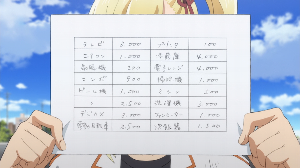 When I saw this, I thought, Oh, cool, I'm gonna try some fun stuff here. So clearly this has to be masked. I suppose you might want to mask the whole thing and redo the grid somehow, which probably wouldn't be too hard either, but I had something else in mind. I started by drawing a clip in the first field.  Of course we don't wanna do that shit 32 times, which is why I write a ton of lua functions. This was probably the first good opportunity to use Clone Clip from Significance. So I tell it to make 4 horizontal and 8 vertical clones, and how wide and tall one field is, and there we go. This is all in one line. (BTW, you can actually draw this in one line with the clip tool, meaning you can make separate shapes. All you have to do is, every time you set the coordinates for a new one, add "m" before the coordinates that appear in the Edit Box. Like this: m 326 166 l 324 203 473 204 473 168 m 486 166 ... and then you keep drawing.)  Now we easily convert the clip to drawing. (I was just clipping an empty line.) I suppose I could have added one pixel to the horizontal distance, but I just used \fscx101.  You may not see it, but I actually had to gradient the mask once I set the white colour. The bottom is a bit darker. But it's only slightly, so I made like 100-pixel strips, and there were only 4 or 5. Then it was just adjusting spaces in the text. (It could be split, but I didn't wanna have that many lines.) I was quit pleased with how easy this was. 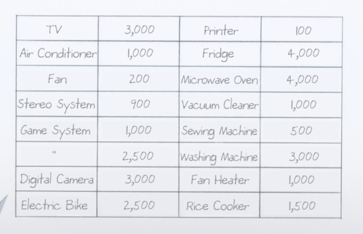 Now for the most fun part... \t This is the tag with which you can do almost anything..... and make everyone's player lag. As a demonstration you can try this: Dialogue: 0,0:00:00.00,0:00:06.00,Default,,0000,0000,0000,,{\an5\q2\fs40\b1\bord1\blur0.1\shad0.1\1a&HFA&\4a&HF0&\t(0,3000,3,\fs75\bord4\xbord10\shad22\blur1\1c&H00FFA9&\3c&H9B2664&\4c&H0C1A4C&\4a&H90&\1a&H00&\fscy150\fsp15\frz15\fax-0.4)}Unlimited Eyecancer Works This will change font size, border size, shadow distance, blur, all colours, transparency, font scaling, font spacing and rotation. Oh and CPU usage. For even more CPU usage, add movement, \clip, the other rotations and \blur15. 2015 Note: It would be hard to make one line lag nowadays, no matter how many transforms. But if it's many lines at the same time... So this gives you the idea of how you can change the basic properties. Use your imagination to figure out how far the options go. Let's try something more practical though. Like text appearing bit by bit. Type some text and place it somewhere. Now use the clip tool to make only the first letter visible. Let's say you get \clip(50,150,100,250). Now add \t, use the same clip in the \t tag, but change the second X coordinate to somewhere after the last letter. If the text ends at 400, you'll use \clip(50,150,100,250)\t(\clip(50,150,400,250)). This will be showing static text gradually from the first letter. See how it works out, and adjust coordinates as needed if something's off. If you need the text to appear in the first 500ms and stay on screen, use \t(0,500,\clip.....) Something similar would be text that moves into a visible area, though here you don't actually need \t. Let's say a person is standing in the picture, text is generated behind his\her back, no pun intended, and the text comes out on the right. So what you do is use \move to make the text move from left to right, and you'll use \clip to make sure the text is not visible behind that person. You'll get a sequence like this:    You'll have to use the vectorial clip for this, to follow the hairline. You could also expand the clip to the other side of the person and just make the text scroll behind her... ...as long as she isn't moving. If she is and you still wanna do this, change \move to \pos & go frame by frame. If after a few hours of that you feel like screaming "Zetsubou shita!", no one will blame you.  Here the text is scrolling bottom to top, hiding behind the bars and the guy. Use a simple \move, tune it so that it moves precisely along with the kanji first. Then use a clip to outline the bar. I set it up so that each of the 2 portions of the text only goes under one bar so that I wouldn't have to clip both for one line. You could, however, lead the clip on the side of the screen to the other bar and cover both of them with one clip. Instead of clipping everything except the bars, you'll just clip the bars and then rewrite the \clip to \iclip, which inverts it. Of course you also have to include the guy's shoulder in the clip. Here's more fun stuff:  Find an awesome font. Set the colours, border etc. Clip around the guy's head and his tools. Apply \move.  This is even more tricky:  Create all signs with colours, borders, shadows, layers etc. Use ASSDraw to create parts of the yellow circle to mask parts of your signs. Change colour of the letters that are close to the yellow circle. Blur appropriate things for the glow effect. Now mocha track over more than 100 frames, as the whole thing is zooming out with random flashes of light. (Then change the episode title and colours every episode.) Another example where you can combine \move and \t is when text is growing larger. You know the trailer kind of stuff where a line appears and seems to get closer, then a few images and another line. You'll use \t(\fs) to make the sign 'grow,' and \move to make up for any inconsistencies that may arise. If the alignment is \an2, then the sign will only expand upward. \an5 will make it expand to all sides, but if you're placing this above a JP sign that's already expanding, you'll need to \move up a bit, otherwise the expansion of both signs may bring them too close together or even overlap. This kind of signs may also use other effects, like the line appears and then slowly gets blurry, or the letters move apart from each other - \fsp. For illustration, try these things out to get the idea of what you can do (use 720p video AND script resolution): Dialogue: 0,0:00:20.00,0:00:25.00,Default,,0000,0000,0000,,{\pos(300,300)\bord0\frx0\fry90\t(0,2000,2,\fry0)\org(20,300)}What is this I don't even... Dialogue: 0,0:00:25.00,0:00:30.00,Default,,0000,0000,0000,,{\an5\fad(1500,0)\move(155,87,1040,670,0,1500)\t(0,1500,\frz-1080)}I still don't... Dialogue: 0,0:00:30.00,0:00:35.00,Default,,0000,0000,0000,,{\move(400,200,800,200,0,3500)\t(0,4000,\fry720)}What Now? Dialogue: 0,0:00:35.00,0:00:40.00,Default,,0000,0000,0000,,{\move(1000,450,300,200)\t(\fs120\bord8)\b1\clip(600,10,800,710)\frx14\fry24\frz10}That's enough! Dialogue: 0,0:00:40.00,0:00:45.00,Default,,0000,0000,0000,,{\b1\org(640,50)\fax1\frz-60\t(\frz60\fax-1)\move(640,630,680,260)\clip(240,85,860,680)}Or is it?! That's about all I can think of right now. The rest is up to your imagination. Remember though that overusing this will cause lag, so nuke any tags that you don't really need, and don't use too high values of the really laggy things like blur, or all rotations at the same time. If there's anything specific that I haven't mentioned anywhere, let me know. 2018 Note: Creating transforms is done using HYDRA. Just check the tags you want, and click on Transform. With scripts like Hyperdimensional Relocator, you can also easily create \move from \pos, align a bunch of lines, move vectorial clips, and all kinds of other things. |