|
|
In order to typeset a sign, you need to time it first. As this needs to be precise, you don't do it on the audio track like with regular lines. Signs need to be frame timed, because if your sign is one frame off, you belong in Hadena. So you rough time the sign first, whether on the audio or by inputting the timecode you got from the translator/typist/editor. (Or, if you don't live in the past, you use this script.) Then you go frame by frame with arrow keys till you find the first frame where the sign appears [the relevant line must be selected in the script]. Then you click the first of the blue icons here: (No. Use fucking hotkeys.) 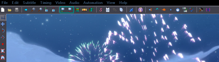 That sets the start time. Use arrow keys to check if you did it right. Then navigate to the last frame the sign is visible on and click the second one. Again try if it's right. The first one sets the time at the start of the visible frame, the second one at the end, so if you use both at the same frame, the sign will be visible on that frame, in other words the duration of the sign will not be zero. This can be used for typesetting signs frame by frame by hand. Many signs start/end at a keyframe, so you can use the audio track for those; for others, you'll need this method. When you've timed your signs, you can begin typesetting. You already know how to create styles, so you'll make one. If you need to override anything, you'll use a few tags like \fs \bord \shad etc. You should know all the basic tags and what they do from here. Note 2018: I've never really used \fs once I learned to TS properly. Recalculator + scaling = size changed in 2 seconds. Border is probably what you'll be changing the most often, maybe the shadow and font size, so you should remember \bord \shad \fs (nope) at least. You should remember the hotkeys to the Cycles script, that is. You may also switch between regular and bold quite a bit, but bold/italics have buttons above the typing area so no need to type those. Let's begin. Here's a simple typeset...  This is something that will appear in every episode, so you want to set as much as possible in the style. The only tags I add here is \fad and \blur. The font, colours and border are set in the style. Don't make the mistake of using the default (or any extreme) values! For example the default has a shadow, but you definitely don't want a shadow here, so make sure you set it to 0. Also don't just assume it's black and white. If you do that, you're going Hadena-style. Get the actual colour from the Japanese sign with the eyedropper tool. Aside from the colours and the border, what will make a difference between a good and bad typeset here is the font choice. So don't just take some basic serif or sans serif font, or something like ComicSans, but find something that will actually match and look good. Speaking of which, you need to know your fonts, and you need to have them in the first place. Also, that sign has no layers and looks like shit anyway.  Now about that fade... Use arrow keys to go frame by frame and find the place where the fade of the jp sign ends. ^ Check the numbers here. They refer to the currently visible frame, in relation to the start/end time of the line you have selected. So this frame is 898ms after the start of your sign and 4102ms before the end of it. If this is where the fade in ends, you need about 900ms fade in. No need to be too precise, one frame is about 40ms, so 10ms more or less won't make a difference. You will then have \fad(900,0). If there's lead out too, you do the same but use the second number. 2015 Note: Apply fade makes it much easier. 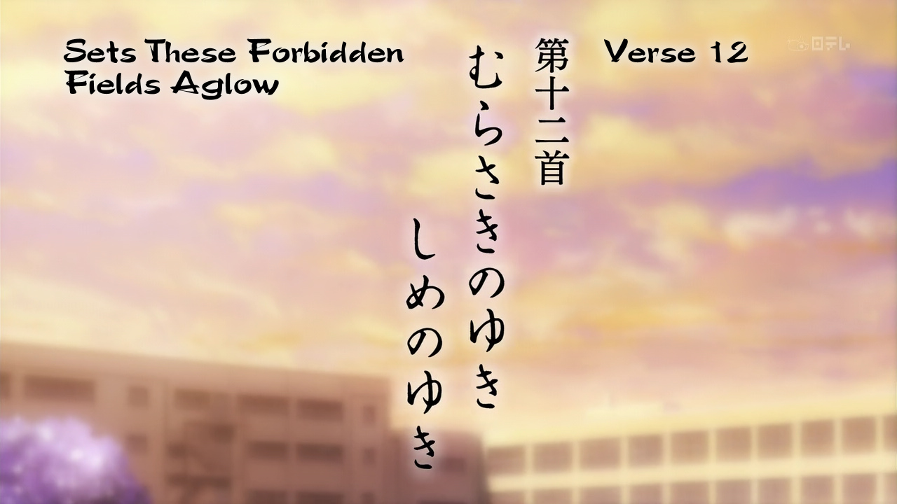 Another example of a title. This one uses \blur10 (for the border). Be aware that using this much blur may cause lag, so only use it on simple static signs. 2015 Note: That was 2011. \blur10 shouldn't be a problem anymore. 2018 Note: That was 2015. \blur10 definitely isn't a problem. Notice the positioning, too. The top of the typesets is aligned with the top of the Japanese sign. Don't just throw the signs somewhere randomly, try to align them with something. Also for episode titles and such, try to keep the same positioning in following episodes. A few notes on using blur. It works differently depending on the borders and shadows you're using. This is text with no border, no shadow, no blur... \bord0\shad0\blur0:  No border, no shadow, with blur... \bord0\shad0\blur2:  Border, no shadow, blur... \bord4\shad0\blur2:  You see it will only blur the outline, not the body. Border, shadow, no blur... \bord4\shad4\blur0:  Border, shadow, blur... \bord4\shad4\blur2:  This blurs both the border and shadow, but not the body. No border, shadow, blur... \bord0\shad4\blur2:  This, however, will blur both the shadow AND the body. So you see it's the border that determines whether the body will be blurred or not. You can't separate the border from shadow for blurring. If you use both, both will be blurred. To bypass that, you'd have to use 2 layers. More on that later. Same if you want to blur the outline AND the body, you need layers. It would look like this:  "Test" is regular mode, "Blur" is 2 layers with the body blurred. Again, more on that in the "Layers" section. Note: This works the same with 'blur edges' - \be. Experiment to find out the difference between one and the other (shows more with higher values). Two things related to blur: Blur is the most essential tag for typesetting. Signs without blur look like shit, so never forget to use it. What I do before I start is to use a script to add blur to all signs. Check the scripts section. Note 2018: Actually, that doesn't really matter. If you're doing things right, adding a default blur should require pressing 1 (one) key. That way you start with blur already present on all signs. 0.5-0.6 will work most of the time. You'll change it to higher when needed. NOTE 1: Do not use \blur.5 instead of \blur0.5 NOTE 2: \blur0.3 does nothing visible. \blur0.4 blurs VERY LITTLE and is only applicable for really sharp video. Don't swarm the script with \blur0.3 when you can see it's not doing anything. ALWAYS check signs at 100% zoom. Use your damn eyes. Here you can see 3 modes of using blur: 1. The "Mer" part. Completely wrong, because it's only 1 layer and the body is not blurred. 2. The "maid" part. Also wrong. It's two layers, but the primary colour of the bottom layer is the same as the top layer. 3. The "Meal" part. This is correct. You can see it looks like the Japanese sign. 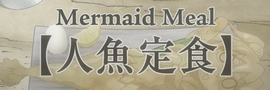 If you can't see the difference, you're blind (or your monitor is terrible) and probably shouldn't typeset. When I separate the layers, it looks like this:  This is one of the most important things to learn about typesetting, so make sure you get this right. The middle part doesn't work because the blurred edges of the top layer create partial transparency, so you can partly see the sharp edges of the font body of the bottom layer. Same thing happens when you use \1a&HFF& on the bottom layer, so DON'T do that either. The "Layers" section of this guide explains it in detail. Sort the script by time! (At least if you live in the early 2010's) [menu -> Subtitle -> Sort All Lines -> Start Time] If you don't do this, vsfilter will screw up blur pretty much whenever there are two or more lines visible on the screen at the same time. Top is sorted by time:  Bottom is not sorted by time. You can see the border on the default style is screwed up. This and worse things happen when you don't sort the sript by time. Of course you don't need that when working, and it's more convenient to have different sorting while working, but always sort the final script you're putting in a release. 2015 Note: This is not an issue anymore. Back to the basics...  Here's another title. Very simple but beginners will often fail. This one has a shadow but does not have a border. Beginners will often use border because there's something black around there and who would bother to look carefully? Border is first so... bam! Well, nope. If your style has border, use \bord0 to kill it. Align your typeset properly. It would be dumb if it was clearly closer to one side. Don't put it under the sign here because it might overlap with main dialogue. Other things to pay attention to: the shadow in this case is not transparent at all; get the shadow distance close enough to the original; try to match the thickness of the letters; and for god's sake don't use a sans serif font like Arial for this. Alternatives that work:   These two are fine. The thickness matches, they have some pointy ends like the original, horizontal lines a bit thinner than the vertical ones... everything all right.   These two are not too bad, but not as good as the previous examples. They're a bit too roundish, lacking any pointy/thin parts. Alternatives that don't work:  Sans Serif doesn't fit here. Square ends don't match at all. Looks dull and inelegant.  This is too thick/wide.  While handwriting is often useful for typesetting anime, because of the calligraphic nature of kanji, here the kanji is actually pretty simple and orderly. The handwriting looks too disorganized. (If you use a Japanese font to add those Japanese "quotation marks", you're a fucking moron.)  Next episode title. Pretty simple - get the sizes right, choose a reasonable alignment, get the border colour right, and use blur. 2015 Note: The inner part is actually lacking blur. (I sucked in 2012.) See section on Layers. You can see it's pretty easy to match the original, so I don't want to see things like this:  Using thin outline without blur = nope. Using thick sans serif font = nope. Vertically it's not aligned with anything. That's a fail on a sign that takes a minute to do right. 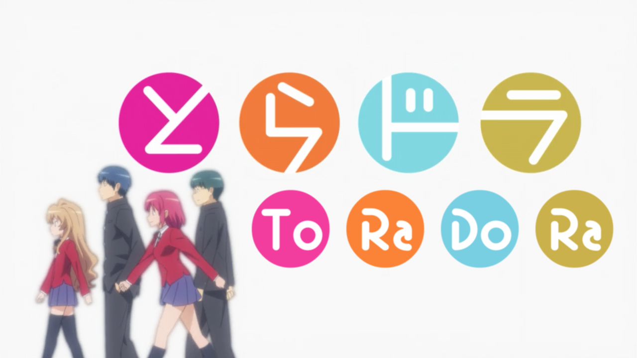 Here's something more interesting. In case it wasn't clear, the smaller circles with To Ra Do Ra are typeset. So what you need is letters and circles. The easiest way to make circles is to use a font with symbols, like wingdings. Find out which letter is a circle and use that. 2015 Note: Please no. Use vector drawings. Masquerade makes circles and other shapes really easy to use. Then find a font that has round edges and isn't too thick. Mine was actually too thin but I solved it by adding some outline in the same colour as the primary - white. It was also narrow so I used something like \fscx120. All of this can be set in the style, so no tags needed. To get the letters exactly in the middle of the circles, I used \an5 - align to centre. That way you can use the same \pos coordinates for both the circle and letters and you know it's right in the centre. Now you just need to find the right place to put the circles. Make sure the vertical coordinate is the same for all of them, and that the spaces between them are always the same. The only thing left is to get the right colour for each circle. Tools for colours are above the typing area. Use the eyedropper tool to get the exact ones you need. Speaking of which - always match the colours exactly, not just approximately. 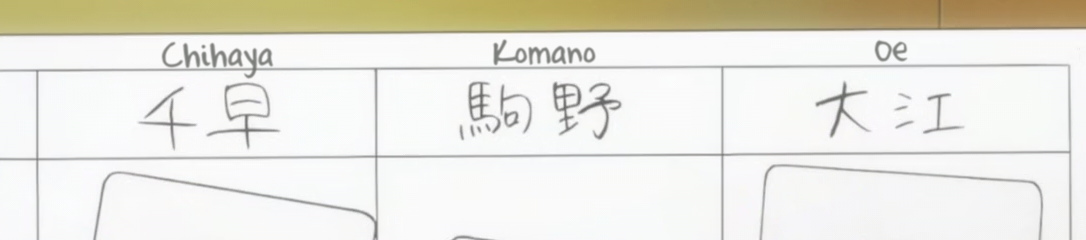 Simple typesets for some names. Handwriting font, match the colour, no border, no shadow, use blur. Easy. 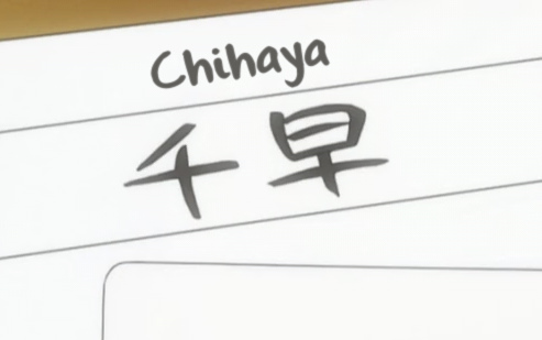 This close up is different than what they had in the first screenshot. It's thicker and darker so you can use bold, or outline in the same colour... however... If you're gonna use some outline to make the font look thicker, make sure you can actually afford it without making the font look unreadable. This is already pushing it, though still not too bad:  Without the border for comparison:  This is pretty bad:  Letters like 'e' or 's' become hard to read, especially if you stretch the font in one direction. Please avoid stretching fonts more than about 10% in one direction unless you have an extremely good reason. In this case the letters even merge with one another, so try to find a better font instead.  White font, thick dark red border, no reason to fail on this. Clearly here you need some handwriting/cartoonish font, and not some Arial/Times New Roman thing. [Actually this fails with blur, but hey, it was a long time ago.] 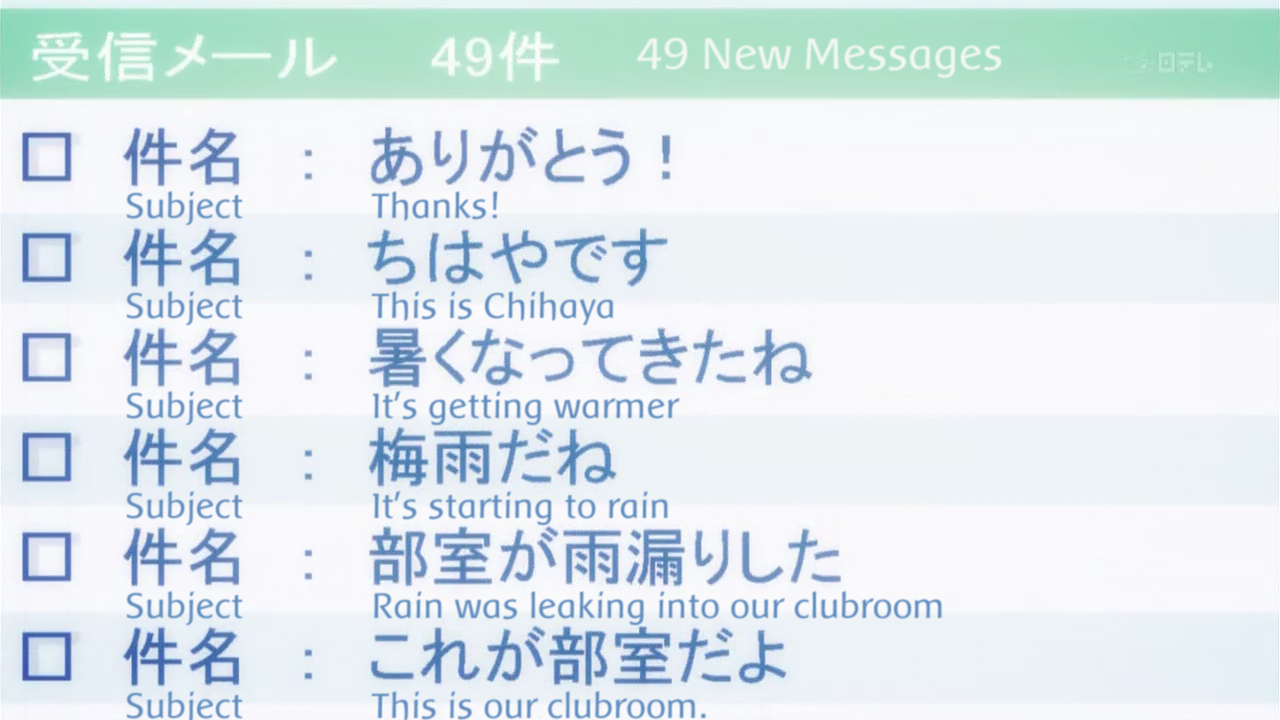 Sometimes you have a bit more to typeset than one line. Here you need a simple sans serif font. I used this one not because it was the best but because I was already using it in the episode and it was good enough. 2015 Note: It should be at least bold/thicker, and the colour is wrong. It should also have a "glow", but back then that would have lagged. Aside from the "49 New Messages" in white, this is all done in one line.
Dialogue: 0,0:08:08.63,0:08:08.67,mail,Caption,0000,0000,0000,,{\blur0.8\c&HBD8B5F&\pos(126,186)}Subject             Thanks!\N\N\N\NSubject             This is Chihaya\N\N\N\NSubject
             It's getting warmer\N\N\N\NSubject             It's starting to rain\N\N\N\NSubject             Rain was leaking into our clubroom \N\N\N\NSubject             This is our
clubroom. \N\N\N\NSubject             I got in trouble with Dr. Harada \N\N\N\NSubject             How do I cut down on faults? \N\N\N\NSubject             This is Chihaya \N\N\N\N
Subject             Karuta players are... \N\N\N\NSubject             About hakama \N\N\N\NSubject             Guess what happened today \N\N\N\NSubject             Notice for the
\N\N\N\NTokyo regional tournament
You can see there are 4 line breaks between the text lines (\N\N\N\N) so that I don't have to make 6+ separate script lines to typeset.Choose font size that will make the lines fit in between the Japanese lines. When you have the font size, make spaces between the Subject and the rest of each line. You could typeset each line separately, but... the whole thing was scrolling up in a non-linear fashion. That also means you can't use \move. So I did this frame by frame, always changing just the \pos tag (you may notice the whole line has more text than you see on the screen - this text scrolls up in the following frames). It was about 20 frames so I had 20 lines in the script. If you typeset each line of text separately, you'd have more than 10 times as many lines in the script. A 20-frame sign is usually pretty pointless to typeset, but the way I did this wasn't really difficult and didn't take much time so I did it anyway. [Note: The colour should be darker, and the font should be thicker.]  This was not bad a few years ago but is pretty bad now. If you can't match the colours precisely, you suck. The Japanese is not black and white, so use the eyedropper tool to get it right. You can easily make this so natural that it won't even look like it was typeset. You could also use \fscx110 or so for a better match. And it's missing blur. 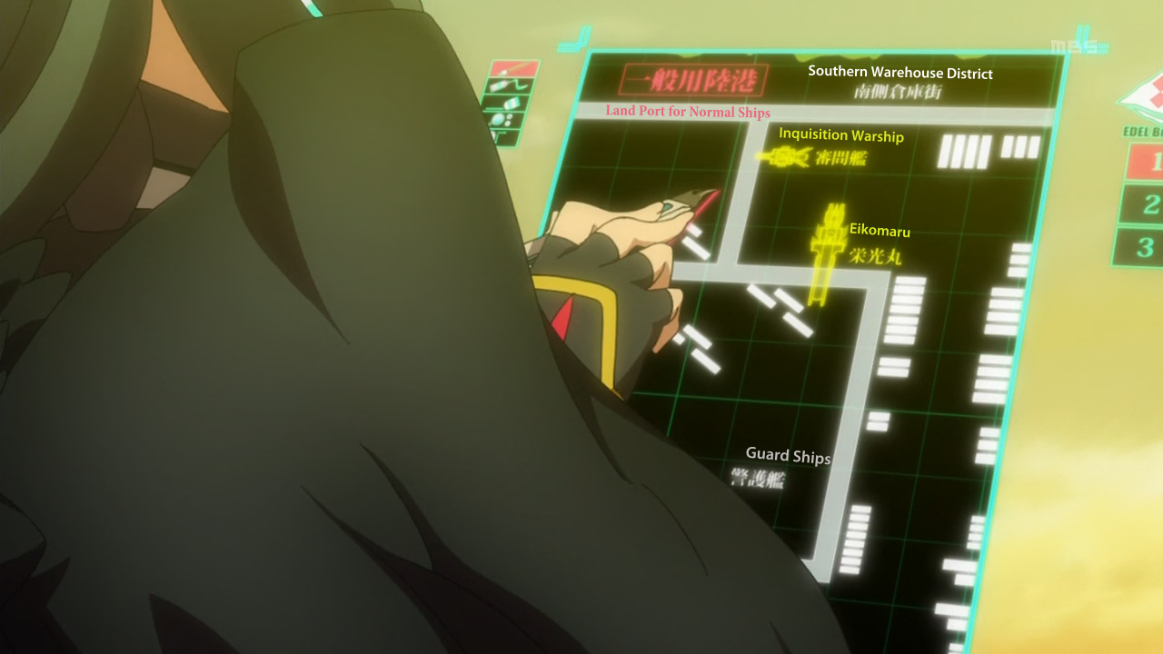 So I gave somebody the task of typesetting this... and this was his first attempt. Positioning is ok. 1 point there. Colours are fine as well. Another point. Alignment of the text is... well, pretty default. More on that in the next chapter. I don't know why the red sign is serif and the rest is sans serif when the JP signs are all the same font. Also the red looks like crap on the light grey background. All that would be passable for a beginner if it wasn't for one obvious problem - no blur. Just adding blur would make it look much better even with the other problems. 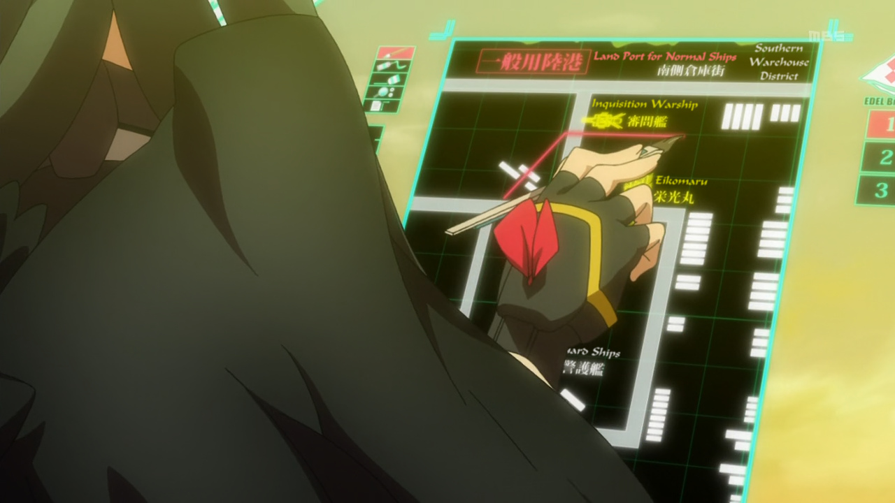 Here for reference is my own typesetting. You can see the blur makes it blend in beautifully, though the slant helps a lot as well, and the font is much better than the Arial-ish thing above. 2015 Note: It needs "glow". As a sidenote, see the hand moving "over" the Guard Ships sign? That can be done with the \clip tag. More on that later. A simple typeset:  1. Matching font with roughly matching thickness of letters. [as the English is usually longer, you may need a lot more letters than the jp, so you can't always match the thickness.] 2. Matching colours. 3. Matching border size. 4. Two layers for blur. That should cover the basics. Just a few more notes. Sometimes instead of blur you can use \be - blur edges. With value 1 they're pretty much the same but with higher values you'll see the difference. Other tags you can use to override the style are \fscx, \fscy, \fsp... again, you should know all these from the link mentioned at the top. I didn't explain \pos because it's so basic that if you can't figure it out on your own, you're hopeless. \an can be useful for signs with a line break - \N. Type something short, then \N, then something long, like "This is \N a meaningless test sentence." Use \pos to place it somewhere on the screen. Then add \an9 or \an1 to see how the text changes alignment while using \pos. One last note about changing margins. Let's use this screenshot:  Numbers 5, 6 and 7 are left/right/vertical margin. Change those numbers to change the margin. The values don't add up, they override the defaults. It's only meaningful when you're NOT using the \pos tag, mostly for default dialogue. You can use this if you need to move the subs to avoid overlapping with something else. For example changing right margin to 500 will move them to the left, changing vertical to 100 will move them up etc. |