|
|
Creating gradients is simple in principle, but since the Gradient Factory script is a bit lame, you can run into some problems. 2015 Note: Nobody uses GradFactory anymore (I hope). Read this part only for understanding how gradients work, and ignore that shitty script. Further down the usage of lyger's 'Gradient everything' script is explained. 2018 Note: HYDRA can create all types of gradients - vertical, horizontal, by character, by X characters, by line, with colours going there and back, etc. First of all, what is a gradient?  Here you can see the colour goes from light blue at the top to dark blue at the bottom. The way to replicate this in typesetting is to chop the sign into a large number of clipped lines, each with a different shade of the colour, like this: 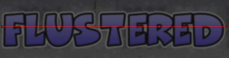 Here I have one line selected, containing this: {\bord0\blur0.6\clip(120,173,411,174)\pos(266,209)\1c&HCE8189&}FLUSTERED You can see that vertically the clip goes from 173 to 174, i.e. the strip is only one pixel wide. You can do 2- or 3-pixel-wide ones, but of course the more pixels per line, the worse it looks. On the other hand, the less pixels per line, the more lines, and the more lag. What Gradient Factory does is create all these lines and give each one a different colour. With 1 pixel per line this can look great, but may lag, especially with fades and stuff. In this example you would choose the top colour, the bottom colour, and the width of the clips. The script does the rest... or that's the idea anyway. It has its own problems though. Now how to start:  Create your basic typeset and set the sizes and colours in the style rather than with tags. Grad Factory nukes all tags from the line except \pos, and creates the clips and colours, which means all your scaling, borders, and other things will be nuked. You can re-add them later, but for several reasons it's best to have as much set in the style as you can. I commonly create a special style just for the gradient I'm making. One reason for that is that the area of the gradient is calculated from the font size in the style. If the style has \fs20 and your typeset has a tag with \fs50, the gradient will create lines for \fs20 and you're fucked. So I recommend setting the style as close to the required result as you can. In the image above, I picked a font and set the colours, borders, layers and blur. The blue colour can be anything, as it will be overwritten by the gradient anyway. 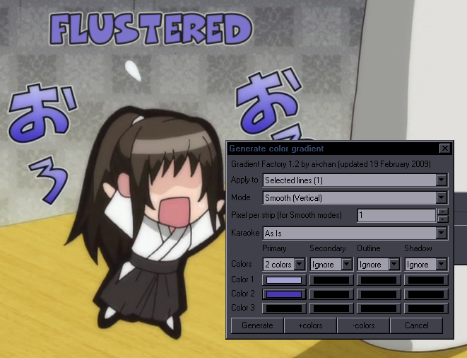 When you have that, run the GradFactory script on the blue layer. Settings are as you see: apply to this one line, vertical gradient, 1 pixel strip, and you only need 2 colours here. If you need more than 3 colours, you use that +colors button. The rest should be self-explanatory. Aside from the font size from the style and nuking the tags, there's another "problem." The gradient isn't calculated for the visible part of the font, but for the whole "box." That means the gradient usually starts a few pixels above the letters and ends a few pixels below, so the start/end colours you selected will be outside the visible range. To compensate for that, you could select a bit lighter colour for the top and a bit darker for the bottom. It may take a few tries and personally I find it the most annoying thing about this script. However, this can be bypassed, and the colours can be tuned with the fbf transform script.  Like I said, the GradFactory will nuke other tags than \pos, \clip and colours, so you'll have to re-add things like blur, but when you do, the final typeset will look something like this^. You may also need fades or whatever, but you get the idea. This is what the gradient will look like in your .ass file: 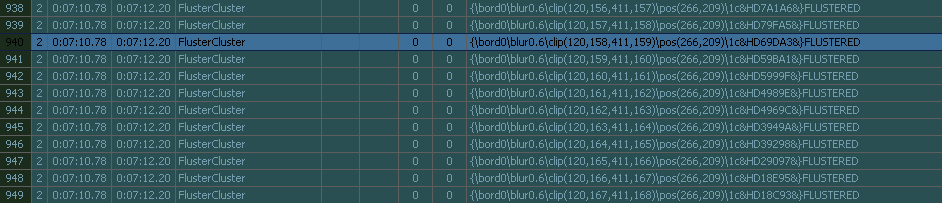 Each line is a clip with a different colour. As I mentioned before, you can use the transform script to tune the colours. Find the top and bottom VISIBLE lines. You'll find that several of the first and last lines actually aren't visible on screen, because, like I said, the gradient is created for the whole "box" of the font. You can delete the extra lines. Then you can set exact colours on the first and last line and run the transform script between them. The transform script even allows you to have different colour gradients for different letters etc. Refer to the info inside the script for how it works. Another problem is gradients for typesets with \frz. The gradient will only be vertical or horizontal, but you may want to rotate the actual text. Since the Factory uses only the style for calculations, the clips wouldn't extend across the whole rotated text. The way to bypass it is to change font size in the style to larger, run the gradient, change size back, and rotate the text. Since larget typesets can mean that you'll have over 100 lines for the gradient, there's a danger of lag. If the typeset is static and has no fade, you can get away with 1-pixel strips. It looks awesome.  Fades are a killer so I'd suggest at least 2-pixel strips. [Also the big "!?" was part of the video and is not a rotated typeset gradient.] Here's one of those \frz ones:  You can also do one with multiple colours:  Yeah, this is a bit laggy but... looks pretty good. 2015 Note: Probably wouldn't be laggy today. Now that I wrote all this... lyger has made creating gradients much easier, so just go here to get the gradient scripts. Let's just quickly explain how to use "Gradient everything" on this example:  1. Create a regular 2-layer sign with blur and set the primary colour to the green at the top. 2. Duplicate the top, green layer. 3. Change the second of the two lines to the blue colour at the bottom. 4. Draw a clip around the text on either the green or the blue layer. 5. Select both lines and run the script with these settings: 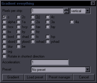 As you can see, with this script you can use gradient with a lot of things. Simple gradients are really easy to make:   An example with gradients on multiple layers.  Aside from the obvious - colours - there's more going on here. There's an extra, white layer, which transforms from alpha 00 to FF both up and down. Since the white is only at the top half, the yellow border needs to be larger there than the red border at the bottom. You can see the border difference on the JP sign too. So there's also a gradient for border on my sign. By the way, you don't have to do all this with the gradient script. Do the basics and use "frame-by-frame transform" to tune the rest. Gradient by Character A different version of a gradient is by character, which means you get new tags for each letter. It's a horizontal gradient with only 1-letter precision rather than by pixels, but you can keep everything in one line. Here's an example:  \fax and \fs is gradiented with lyger's 'Gradient by character'; colour is gradiented with my Colorize script. lyger's can do all applicable tags. Colorize only does colours, but it has some extra options, like the HSB gradient used here, instead of RGB. Of course this could then be combined with a vertical gradient. HYDRA can gradient pretty much anything in various ways, so check the gradient section in the manual. |