|
|
Probably one of the most useful tools, once you make it far enough that you're actually trying to make signs look nice, is layers. You can use them for various effects. The two most important ones are: 1. You can have multiple borders/shadows 2. You can have blur between primary and outline colour, which makes signs look a LOT better If you're inventive, you can always add some extra effects to that. 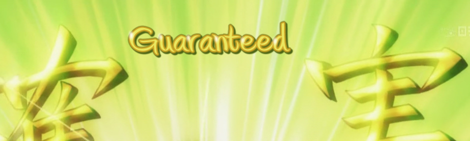 ^ This sign here has 2 borders - orange and dark grey. Clearly you can't make it in one line. So what you do is you make one sign, with orange border and no shadow, then duplicate it (right click on the line in script), and change one of them to larger border in dark grey and add shadow. For example you'll have \bord2 for the orange one and \bord4\shad2 for the dark grey. The important part is that the orange one has to be on top. For that purpose there's this thing called layers. You can change the layer number above the typing area, next to the start time: 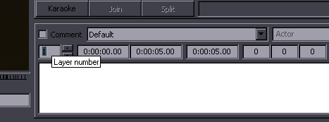 So the orange one will be layer 1 and the other layer 0, or whatever other numbers but the orange one has to be higher. You will also use this when regular dialogue subs overlap with signs! The dialogue has to be on top, obviously. Some notes about this sign: The JP doesn't have an orange border. The primary colour ranges from yellow to orange. Choosing only one would make it look too plain and you can't use a texture instead. (Well, you could probably imitate it somehow if you were inventive but this is about basics.) I wanted to have both yellow and orange in there and this was the easiest way to do that. Also the font was pretty thin and this made it thicker. If you're looking carefully and actually paying attention, you have noticed the white "dots" on the sign. The JP sign has light reflecting off of it (coming from top left), creating blurry white areas. Since I like doing things that nobody else does, I wanted to try to imitate this somehow. It's a kind of silly idea that nobody would bother even thinking of, much less trying to do it, but for me, work without creativity would be too boring. Obviously this is nothing like real light effects, but I think considering the tools available it's not all that bad. So how did I do this? Create a third line, layer 3, white colour, no border/shadow. Type some commas with a few spaces between them. Use a lot of blur. Then just figure out the sizes and spaces and rotation etc. to make the dots fit into places you want them at (keeping the light from top left pattern). That's it. This sign still has some flaws and could be better, but let's just say that if you have a script with 30 signs of varying difficulty and you need to sleep soon, you don't always do your best. I use double layer signs quite often mostly for one specific reason. If you check the sign above, you'll see that despite the blur on the outside, the border between yellow and orange is sharp. That's because when you use blur, it only blurs whatever's on the outside, ie. if you have an Outline, it won't blur the inner letters. That is sometimes a problem because the Japanese signs are usually blurred on the inside as well, and the sharp edge between the inside and the border just looks bad. The solution to that is to create another layer without the border and blur it as well. In other words you duplicate the sign, make one layer 1 and add \bord0. I recently redownloaded the video and fixed the colours and blur [keeping the font though]: 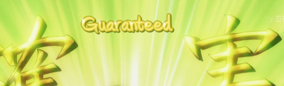 Here's another example:  The first 2 letters "Re" are only one layer, without the inner blur. The rest is 2 layers as described above. The red in the "Re" is sharp and compared to the kanji looks bad. For illustration I also added one more layer to the right half of the sign, adding the soft, blurry, reddish background. It's the lowest layer and uses reddish border with lots of blur. I didn't use this in the release, this is just to show that it can be done. It's actually \blur12 and the sign is fading in and would have 3 layers, so it might lag. Note 2018: These days you can throw around \blur20 without worrying about that. This sign could look much better - I think I did this on a workraw, meaning small, blocky video with poor colours, so I couldn't see details very well. Anyway, 12 episodes got released at this point and no one's complained so far, so I guess it's ok. 2015 Note: I think the inner blur is still wrong because \1a for the white layer is probably red. (Explained further below.) 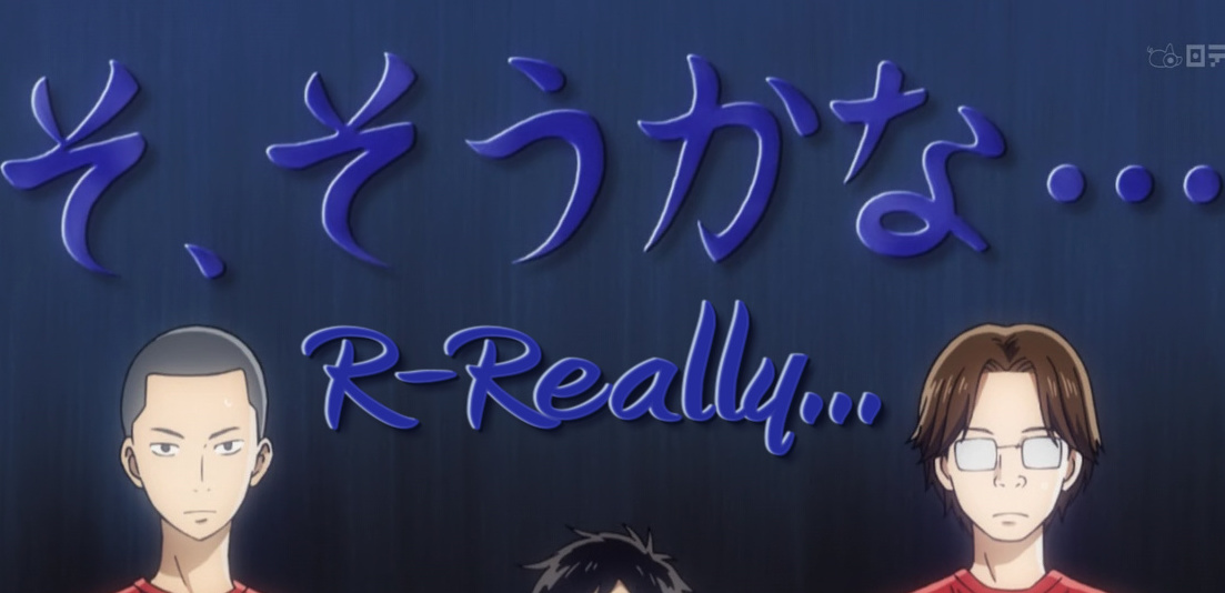 This was quite a challenge (in 2011), for several reasons. Blue letters, white edge on the left, black on the right, and blurry shadow behind it... what to do? On top ot if, the letters were appearing one by one... but before we get to that, we have to deal with the basic design first. Obvious things like font, size, position and main colour should be... obvious. If we want the white/black edges and the shadow, we'll need at least 3 layers. You can probably figure out how to do the black edge on the right and the blurry shadow. The black edge is regular shadow, and the background is another layer with more blur. But what about the white? Well, aside from needing another layer for that, there are some extra tags that will help us. Besides \bord there's also \xbord and \ybord, and besides \shad there's \xshad and \yshad. This allows you to extend the border differently vertically than horizontally, and make the shadow be cast in any direction. Here I needed shadow (white) so i used \xshad-3\yshad-1, which positions the shadow 1 pixel above and 3 pixels to the left (yes, negative values to go up and left). The whole thing looked like this: layer 2: {\fad(0,600)\fs150\fax0.1\bord2\xshad-3\yshad-1\4a&H00&\blur0.8\pos(620,280)\3c&H9E362E&\4c&HE7C4B4&\c&H9A2B24&}R-Really... layer 1: {\fad(0,600)\fs150\fax0.1\bord2\shad3\4a&H00&\blur1\pos(620,280)\c&H9B352E&\3c&H9E362E&\4c&H250F09&}R-Really... layer 0: {\fad(0,600)\fs150\fax0.1\bord0\shad0\blur4\pos(628,288)\c&H230E0C&}R-Really... [\4a&H00& changes the shadow to opaque, because the default was partly transparent - it's a variation of the \alpha tag.] Well, this was only the last part. As I said, it was appearing letter by letter. First I used \t and \clip to make it appear continuously. Good thing was I still had only 3 lines in the script but it turned out it was lagging like hell. [Note: having 3 layers with \t on all of them So instead I had to go for alpha timing, making it appear letter by letter (almost, because the JP has fewer letters). This was still pretty intense but worked out without lag. It was a bit more work, and I ended up with 18 lines for this sign, but it looked pretty cool. Signs with border and blur - how to do them right After typesetting a dozen shows I realized that making 2 layers for all signs with a border is a pretty essential thing if you want the signs to look good. It's pretty much one of the most important things that will distinguish a good typeset from a mediocre one, without much effort. It's fairly simple and easy to do but it took me some time to figure out how to do it right. The first step was to just make 2 layers and nuke border on the top one [of course blur would be there from the beginning, so by duplicating the line it's on both]. Then I realized that there's a problem with that. Let's say you have black primary colour and white outline. You make 2 layers, nuke the border on the top one, and have let's say \blur0.6. The result, however, will not be real blur0.6 on the black colour. The blurred outline has by definition some transparency, which means that the sharp black border from the bottom layer is still partly noticeable. How much will depend on the colours. Sometimes it looks pretty good; other times it's almost as sharp as it was in one line.  Here we have two examples (above & below). Left image is one line, middle is two lines as described above, right is the correct way [we'll get to that in a minute]. You can see the left ones are too sharp and the right ones look good. The middle one for Touch is not bad, but the letters got a bit thicker. In the Click example, the middle looks just as bad as the left one. So you see this is not working right. 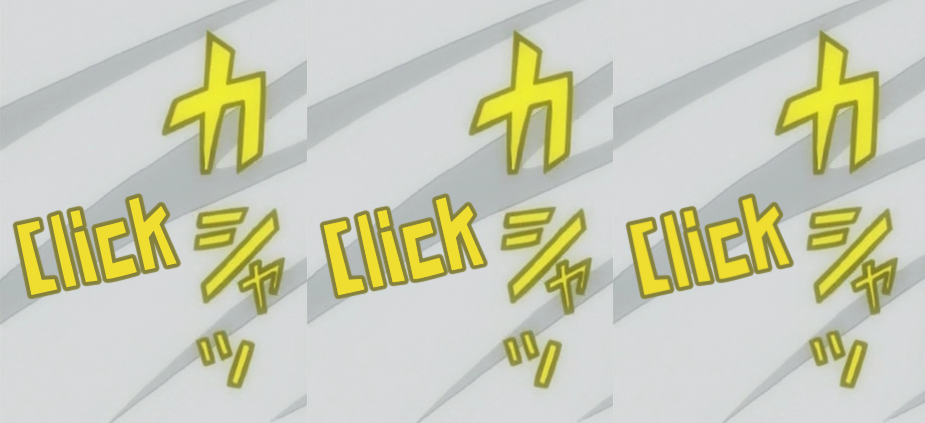 One idea that I had, and apparently others too, was to make the primary colour for the bottom layer transparent. While that sounds reasonable, it doesn't really work either, because the inner edge of the outline is still sharp. So again it will depend on colours used how that's gonna look. Here's an example:  You can see on the lighter colours it looks ok [because there's a light colour behind them], while on the darker ones there's a thin white line between the primary and outline. The blur on the top layer makes partial transparency just before the outline, and the bottom layer is fully transparent for the primary colour, so you can see a bit of whatever the background colour is. If the bg happens to be similar to your primary colour, it may look ok. But it's not something you can rely on. So the final trick that makes it look good is to make the primary colour of the bottom layer the same as the outline. You can see the result on the right part of the Touch and Click pictures, or on these two signs here:  While it may seem like a bother to make 2 layers for almost every sign, it's not really that much effort. (Yeah, one click.) Especially since most of you reading this probably don't have more than 20 signs per episode most of the time. I've worked on Maria Holic Alive and Acchi Kocchi [in case you can't tell], which means about 80 signs per episode and I make 2 layers for anything that has border. Here's the routine to do it [except it's 2013 now and we use scripts for pretty much everything we do]: 1. type the needed blur and border to your line 2. use eyedropper to select primary and outline colour ...that's what you'd do anyway, now the layers... 3. duplicate the line [I use just ctrl+C/ctrl+V since it's probably the fastest] 4. change the top line to layer 1 and rewrite border to 0; hit Enter to get to the second line 5. double click on the tag for outline colour, ctrl+C, double click on tag for primary colour, ctrl+V In other words, once you have 2 layers, you cange one to layer 1 and set \bord0, and in the other one you copy the colour from \3c to \c. It's pretty fast. But in case you're really lazy, here's lyger's script. I also made my own version with some different options, but it's less tested. Each of them works differently and one may work better in specific situations than the other, but in most cases either one should be fine. 2015 Note: I don't know if anybody still uses lyger's script for this (I think it's unlikely), but 'Blur and Glow' is well tested and many times upgraded, so it should probably be your primary tool for layers. Another thing I do with layers is actually for signs that don't have a border [now included in my script as 'Glow']. Sometimes you have signs that have this vague, hazy, blurry surrounding, like in this picture:  This is how you'd normally typeset it, and I'm sure you can see the difference. This is a regular blur of about 0.6. If you use more blur, the letters will become unreadable and won't look like the original at all. If you use a border and blur it a lot, it will be all kinds of messed up and look even worse. So we need two layers again. However, I use both layers without border. For the bottom layer, we need something in the range of \blur1 - \blur3. With a border you'd have problems... If you use \blur3 with \bord1 or less, you'll get a sharp edge between primary and outline colour. Smoothness gone. If you use \blur3 with \bord2 or more, it becomes unreadable because it makes the letters too thick. The solution is to not use border, and use \blur3 for the bottom layer and \blur0.6-0.8 or so for the top. This basically gives you a double blur and looks like this:  At first glance it may not look like much of a difference, but if you switch between the views [commenting the bottom layer], you can see it clearly. Again, how much better this looks will depend on the colours used, the background etc. Here's another example:  This may be slightly overdone, but at least you can see it more clearly. You can't do this in one layer, and you can't do it with border either. The one thing I haven't mentioned yet is that you need to adjust the bottom layer not only with the value of blur, but also colour. With the same colour as the top layer it will usually look too thick. So you just make the colour brighter/darker till you get the effect you need. You could also do this using the alpha tag. With the eyedropper tool changing colour may be faster but in some cases alpha might look better. For the colour you usually only need to change brightness, but sometimes the outline has a different hue as well. Note 2018: Since you're putting 2 layers on top of each other, the resulting colour for the body of the letters may get a bit too dark. You can fix that by adding some alpha to the top layer as well. Just add slowly until it "looks" good. Here's a more complex example with 3 layers. 2 for blurring the primary and outline, and 1 to add that soft haze around.  When you just look at this, you'll barely notice the 3rd layer. But when it's not there, you'll clearly notice that it's missing and the typeset will stand out. Good typesetting is more about the viewer not noticing somethnig rather than noticing. Another example:  And some more examples of using layers...  Typical case of 2 borders. You can make this blend in really well... if you have 3 layers, all with blur. (One click with Blur and Glow. OK, maybe two.)  3 layers...  Top layer - shadow, bottom layer - outline. 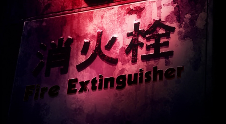 This one... well... let me just show you. Layers top to bottom: {\blur0.8\yshad-0.5\fax-0.32\frz8.624\move(597,70,597,788)\4a&HCC&\4c&HBEB4FF&\c&H000005&}Fire {\4a&H00&\yshad-0.5\4c&H1700A4&\c&H010007&\fax-0.25}Ext{\fax-0.22}in{\4a&H80&\fax-0.2}gui{\fax-0.19}sh{\4a&HAA&}er {\blur1\shad6\xshad0\fax-0.32\frz8.624\move(597,70,597,788)\4a&H60&\c&H000000&\4c&H000000&}Fire {\c&H06001D&\4c&H000016&\fax-0.25}Ext{\fax-0.22}in{\fax-0.2}gui{\fax-0.19}sher {\blur1.5\yshad-0.5\fax-0.32\frz8.624\move(597,70,597,788)\3c&H3511B1&\alpha&HFF&\c&H2E0E96&\4c&H240778&}Fire {\alpha&H00&\fax-0.25}Ext{\fax-0.22}in{\fax-0.2}gu{\alpha&HFF&}i{\fax-0.19}sher {\blur1\yshad-0.5\fax-0.32\frz8.624\move(597,70,597,788)\4a&HCC&\c&H020108&\4c&HBEB4FF&}Fire {\4a&H00&\yshad-2.2\xshad-0.8\4c&HF6F5FF&\fax-0.25}Ext{\fax-0.22}in{\4a&H80&\fax-0.2}gui{\yshad-1.8\fax-0.19}sh{\4a&HAA&}er Kinda hard to explain this, but aside from multiple layers with multiple colours [red, almost black, almost white] you need different effects in different parts. You need more light on the "Extin", "Fire" needs to be much darker, different shadow colours, different shades of red around the letters, different \fax every few letters, varying transparency etc. And the whole thing is moving. Yep, took about half an hour. If an episode only has like 5-10 signs, I play with them a bit more. One more thing layers are used for - to mask the orignial sign and typeset over it. More on that in the next chapter. |